
15-1. flex-wrap
15-2. flex-direction
15-3. flex-flow
15-4. justify-content
15-5. align-items
15-6. align-self
15-7. order
15-8. align-content
15-9. flex-basis
15-10. flex-grow
15-11. flex-shrink
15-12. flex
14. 다단 레이아웃
다단: 레이아웃을 여러개의 컬럼으로 쪼개서 구성한다는 의미.
column 속성을 이용하여 텍스트를 여러 개의 단으로 생성.
column-count: 단의 갯수를 설정.
column-rule: 단과 단 사이의 구분선, 구분모양, 두께, 색상을 설정.
column-gap: 단과 단 사이의 여백 설정.
column-span: 단과 단 사이의 포함요소를 다단편집에서 해제.
예) . col > h2 { column-span: all; }
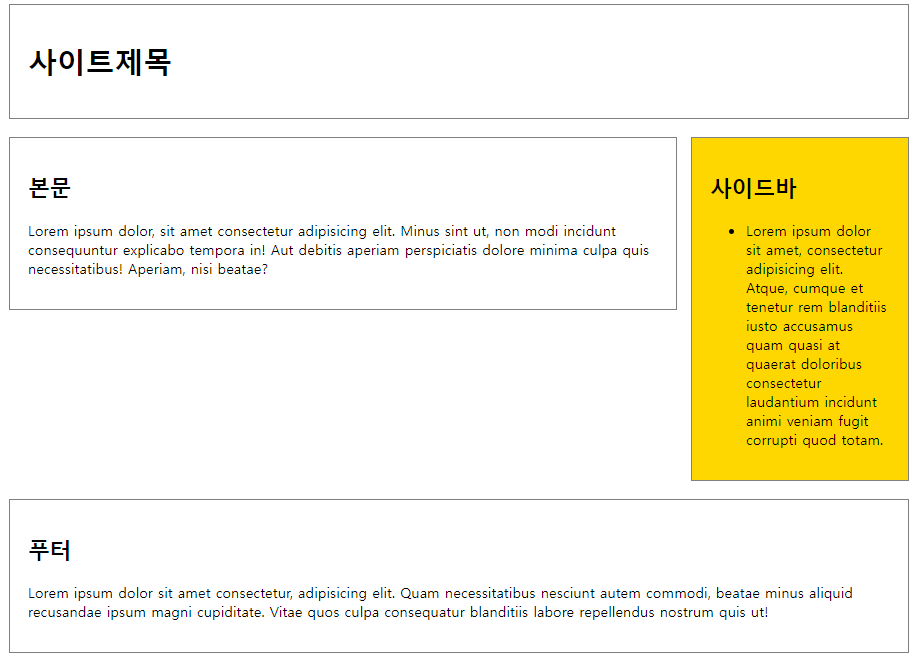
예1) 외부 스타일을 이용한 2단 레이아웃 제작
<head> <title> 2단 레이아웃 </title> <link rel="stylesheet" href="./css/1.2단레이아웃.css"> </head> <body> <div id="container"> <header id="header"> <h1>사이트제목</h1> </header> <div id="contents"> <h2>본문</h2> <p>Lorem ipsum dolor, sit amet consectetur adipisicing elit. Minus sint ut, non modi incidunt consequuntur explicabo tempora in! Aut debitis aperiam perspiciatis dolore minima culpa quis necessitatibus! Aperiam, nisi beatae?</p> </div> <div id="sidebar"> <h2>사이드바</h2> <ul> <li>Lorem ipsum dolor sit amet, consectetur adipisicing elit. Atque, cumque et tenetur rem blanditiis iusto accusamus quam quasi at quaerat doloribus consectetur laudantium incidunt animi veniam fugit corrupti quod totam.</li> </ul> </div> <footer id="footer"> <h2>푸터</h2> <p>Lorem ipsum dolor sit amet consectetur, adipisicing elit. Quam necessitatibus nesciunt autem commodi, beatae minus aliquid recusandae ipsum magni cupiditate. Vitae quos culpa consequatur blanditiis labore repellendus nostrum quis ut!</p> </footer> </div> </body> |
| <'1.2단레이아웃.css' 파일> #container { width: 1000px; margin: 0 auto; } header { padding: 20px; border: 1px solid gray; margin-bottom: 20px; } #contents { border: 1px solid gray; padding: 20px; width: 700px; float: left; } #sidebar { padding: 20px; background-color: gold; border: 1px solid gray; width: 200px; float: right; margin-bottom: 20px; } #footer { border: 1px solid gray; padding: 20px; clear: both; } |
예2) 외부 스타일을 이용한 3단 레이아웃 제작
| <head> <title>layout2</title> <link rel="stylesheet" href="./css/2.3단레이아웃.css"> </head> <body> <div id="container"> <header id="header"> <h1>사이트제목</h1> </header> <div id="sidebar1"> <h2>사이드바</h2> <ul> <li>항목1</li> <li>항목2</li> <li>항목3</li> <li>항목4</li> </ul> </div> <div id="contents"> <h2>본문</h2> <p>Lorem ipsum dolor sit amet, consectetur adipisicing elit. Fugit nam commodi dicta libero? Nemo dolorum delectus, unde, voluptatibus at, incidunt mollitia accusantium modi saepe sequi pariatur esse molestias dolore eveniet.</p> <p>Lorem ipsum dolor sit amet, consectetur adipisicing elit. Fugit nam commodi dicta libero? Nemo dolorum delectus, unde, voluptatibus at, incidunt mollitia accusantium modi saepe sequi pariatur esse molestias dolore eveniet.</p> <p>Lorem ipsum dolor sit amet, consectetur adipisicing elit. Fugit nam commodi dicta libero? Nemo dolorum delectus, unde, voluptatibus at, incidunt mollitia accusantium modi saepe sequi pariatur esse molestias dolore eveniet.</p> <p>Lorem ipsum dolor sit amet, consectetur adipisicing elit. Fugit nam commodi dicta libero? Nemo dolorum delectus, unde, voluptatibus at, incidunt mollitia accusantium modi saepe sequi pariatur esse molestias dolore eveniet.</p> </div> <div id="sidebar2"> <h2>사이드바</h2> <ul> <li>항목1</li> <li>항목2</li> <li>항목3</li> <li>항목4</li> </ul> </div> <footer id="footer"> <h2>푸터</h2> <p>저작권 정보</p> <p>연락처 등</p> </footer> </div> </body> |
| <'2.3단레이아웃.css' 파일> #container { border: 1px solid gray; padding: 20px; width: 1000px; margin: 0 auto; } header { padding: 20px; border: 1px solid gray; margin-bottom: 20px; } #sidebar1 { width: 150px; padding: 20px; border: 1px solid gray; float: left; margin-right: 20px; } #contents { width: 535px; padding: 20px; border: 1px solid gray; margin-bottom: 20px; float: left; } #sidebar2 { width: 150px; padding: 20px; border: 1px solid gray; float: right; } footer { padding: 20px; border: 1px solid gray; clear: both; } |
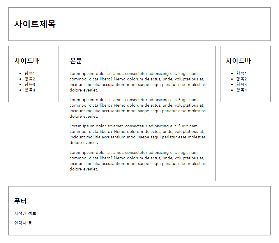
contents의 width에 따른 마진의 양쪽 길이를 맞추는 것은 수작업으로 일일이 맞추어야 하나,
대부분 실무에서는 퍼블리셔들이 진행해주므로 큰 문제는 없음.
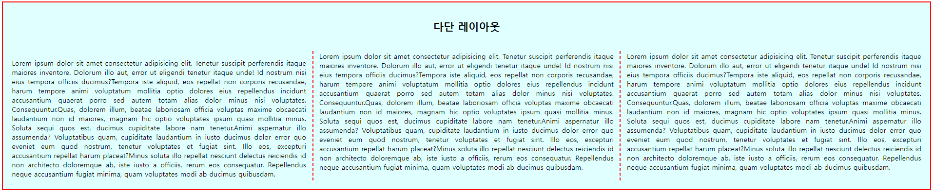
예3) 내부 스타일을 이용한 다단 레이아웃 제작
<head> <title>다단 레이아웃</title> <style> h2 { padding: 0 0 20px; text-align: center; } div.col { text-align: justify; padding: 20px; background-color: lightcyan; border: 3px solid red; column-count: 3; column-gap: 30px; column-rule: 3px dashed red; } .col>h2{column-span: all;} </style> </head> <body> <div class="col"> <h2>다단 레이아웃</h2> <p>Lorem ipsum dolor sit amet ... ab ducimus quibusdam.</p> </div> </body> |
15. Flex 레이아웃
요소를 쉽게 배치하고 정렬하기 위한 방법.
요소를 행(row) 또는 열(column)로 정렬할 수 있으며, 요소의 크기를 동적으로 조정하고 공간분배와 정렬을 편리하게 할 수 있음.
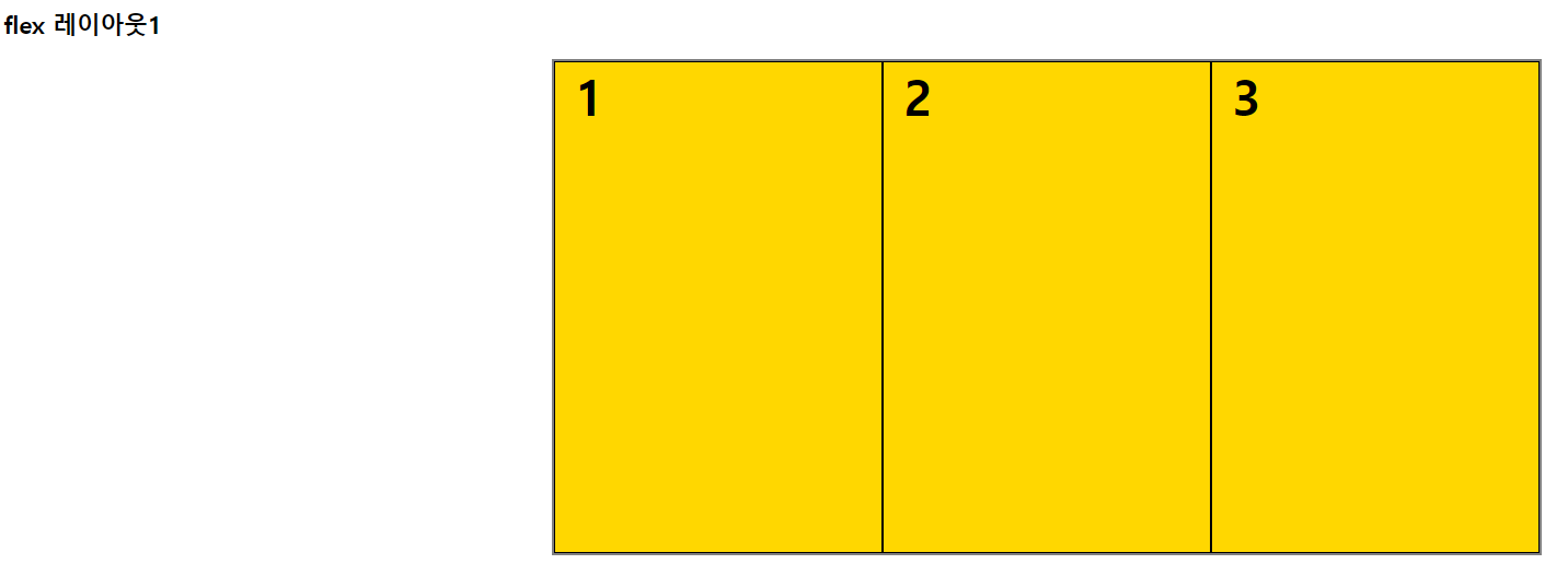
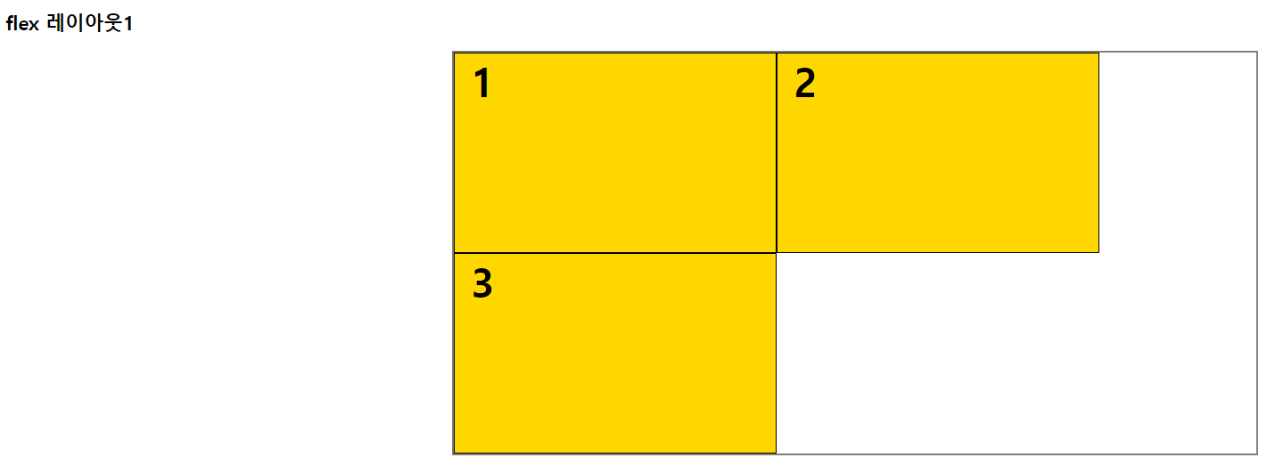
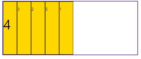
15-1. flex-wrap
요소들이 한 줄에 배치되지 않을 때 줄바꿈 여부를 설정.
예)
<head> <title>flex레이아웃1</title> <style> #container { width: 1000px; height: 500px; margin: 0 auto; border: 3px solid gray; display: flex; flex-wrap: } #container > div { width: 400px; border: 1px solid black; background-color: gold; } span { font-size: 50px; font-weight: bold; padding: 20px; } </style> </head> <body> <h2>flex 레이아웃1</h2> <div id="container"> <div id="box1"><span>1</span></div> <div id="box2"><span>2</span></div> <div id="box3"><span>3</span></div> </div> </body> |
flex-rap: nowrap: 기본값. flex 요소가 다음 줄로 넘어가지 않음. 요소의 너비를 줄여 한 줄에 배치.
flex-wrap: wrap: flex 요소의 여유 공간이 없다면 다음 줄로 넘김.
flex-wrap: wrap-reverse: flex 요소의 여유 공간이 없다면 다음 줄로 넘김.(단, 아래쪽이 아닌 위쪽으로 넘김.)
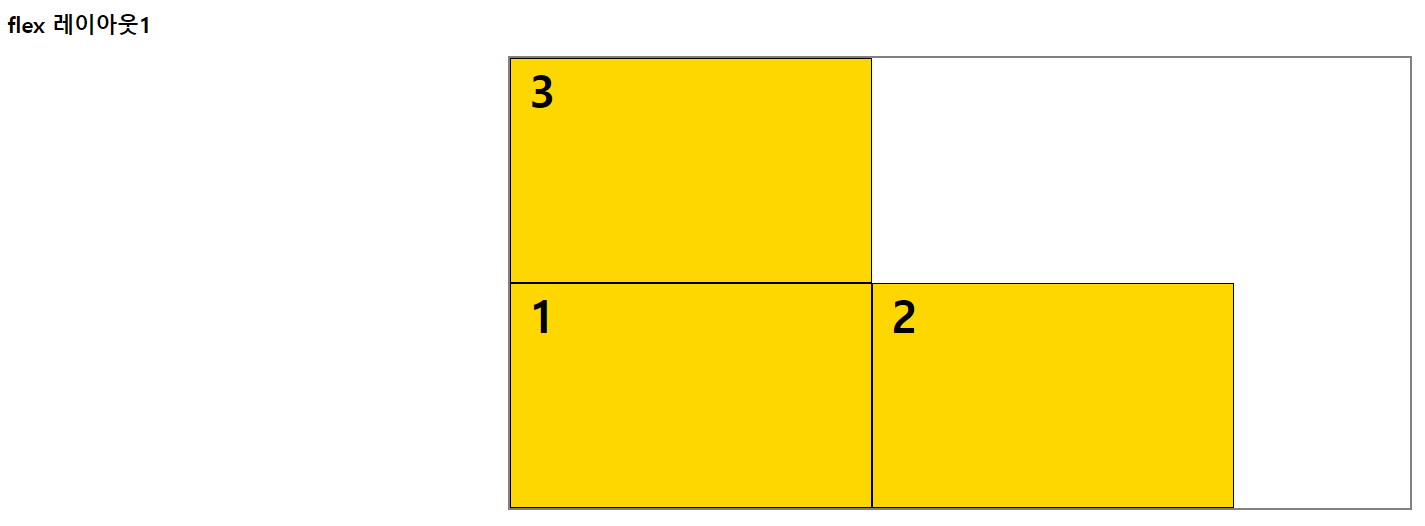
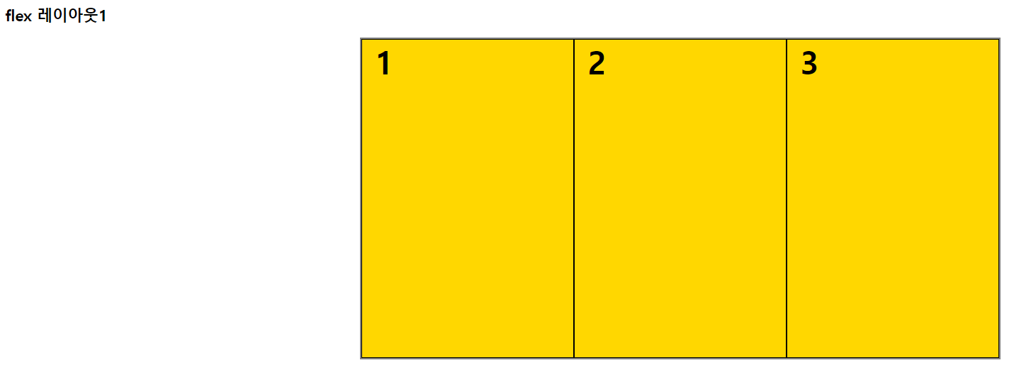
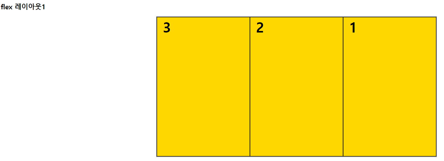
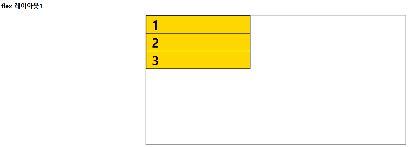
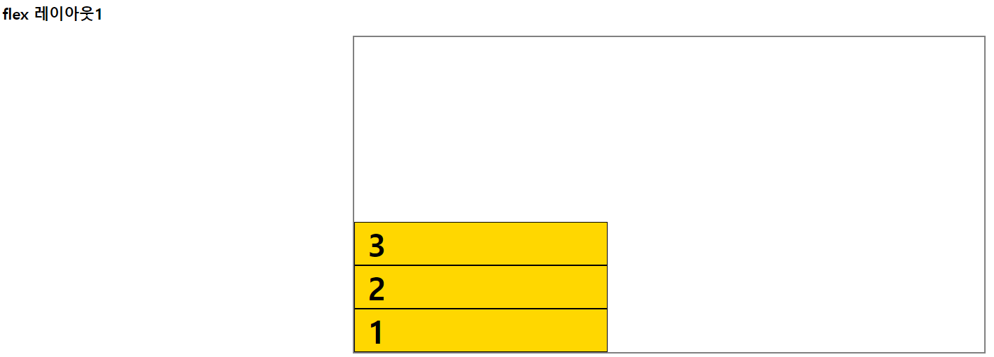
15-2. flex-direction
주 축(main axis)의 정렬방향을 설정.
예)
<head> <title>flex레이아웃1</title> <style> #container { width: 1000px; height: 500px; margin: 0 auto; border: 3px solid gray; display: flex; flex-wrap: nowrap; flex-direction: } #container > div { width: 400px; border: 1px solid black; background-color: gold; } span { font-size: 50px; font-weight: bold; padding: 20px; } </style> </head> <body> <h2>flex 레이아웃1</h2> <div id="container"> <div id="box1"><span>1</span></div> <div id="box2"><span>2</span></div> <div id="box3"><span>3</span></div> </div> </body> |
flex-direction: row: 기본값. 가로로 배치.
flex-direction: row-reverse: 가로로 배치(반대로).
flex-direction: column: 세로로 배치.
flex-direction: column-reverse: 세로로 배치(반대로).
15-3. flex-flow
flex-wrap과 flex-direction을 한꺼번에 지정할 수 있는 속성.
예) flex-flow: row nowrap;
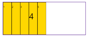
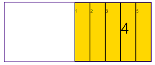
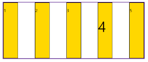
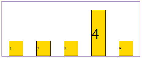
15-4. justify-content
주 축(main axis) 정렬방식을 설정.
예)
<head> <title>flex레이아웃2</title> <style> .wrapper { width: 500px; height: 200px; margin: 0 auto; border: 3px solid rebeccapurple; } .wrapper div { width: 50px; border: 2px solid black; background-color: gold; } #container { display: flex; justify-content: } </style> </head> <body> <h2>flex레이아웃2</h2> <div id="container" class="wrapper"> <div id="box1"> <p>1</p> </div> <div id="box2"> <p>2</p> </div> <div id="box3"> <p>3</p> </div> <div id="box4"> <p style="font-size: 50px;">4</p> </div> <div id="box5"> <p>5</p> </div> </div> </body> |
justify-content: flex-start: 기본값. 앞쪽에서부터 배치.
justify-content: flex-end: 뒤쪽에서부터 배치.
justify-content: center: 가운데 배치.
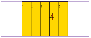
justify-content: space-between: 요소 사이에 여유공간을 두고 배치.(앞뒤 양쪽에 요소를 붙임)
justify-content: space-around: 요소 사이에 여유공간을 두고 배치.(앞뒤 약간의 공간을 둠)
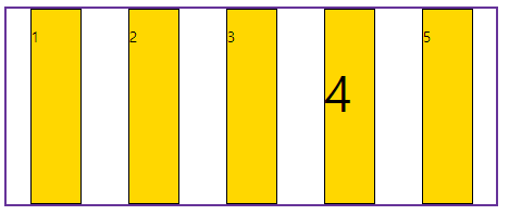
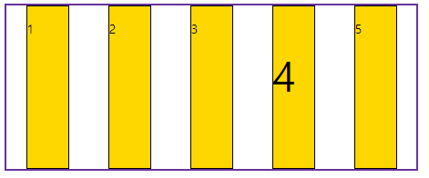
15-5. align-items
교차 축(cross axis) 정렬방식을 설정.
예)
| <head> <title>flex레이아웃3</title> <style> .wrapper { width: 500px; height: 200px; margin: 0 auto; border: 3px solid rebeccapurple; } .wrapper div { width: 50px; border: 2px solid black; background-color: gold; } #container { display: flex; justify-content: space-around; align-items: } </style> </head> <body> <h2>flex레이아웃3</h2> <div id="container" class="wrapper"> <div id="box1"> <p>1</p> </div> <div id="box2"> <p>2</p> </div> <div id="box3"> <p>3</p> </div> <div id="box4"> <p style="font-size: 50px;">4</p> </div> <div id="box5"> <p>5</p> </div> </div> </body> |
align-items: stretch: 기본값. 수직축 방향으로 늘어남.
align-items: flex-start: 시작점으로 정렬.
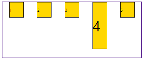
align-items: flex-end: 끝점으로 정렬.
align-items: center: 가운데 정렬.
align-items: baseline: 텍스트 베이스라인(가상의 밑줄) 기준으로 정렬.
15-6. align-self
교차 축(cross axis) 정렬값을 설정.
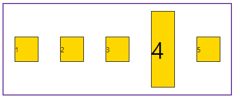
15-7. order
요소의 순서를 설정.
예)
<head> <title>flex레이아웃2</title> <style> .wrapper { width: 500px; height: 200px; margin: 0 auto; border: 3px solid rebeccapurple; } .wrapper div { width: 50px; border: 2px solid black; background-color: gold; } #container { display: flex; } #box1 { order: 5; } #box2 { order: 3; } #box3 { order: 2; } #box4 { order: 1; } #box5 { order: 4; } </style> </head> <body> <h2>flex레이아웃2</h2> <div id="container" class="wrapper"> <div id="box1"> <p>1</p> </div> <div id="box2"> <p>2</p> </div> <div id="box3"> <p>3</p> </div> <div id="box4"> <p style="font-size: 50px;">4</p> </div> <div id="box5"> <p>5</p> </div> </div> </body> |
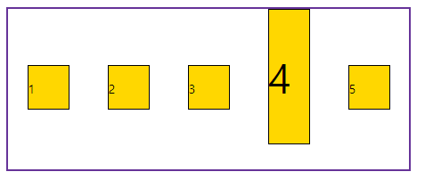
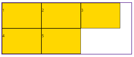
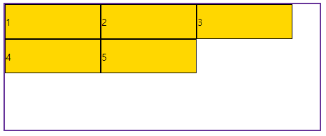
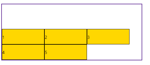
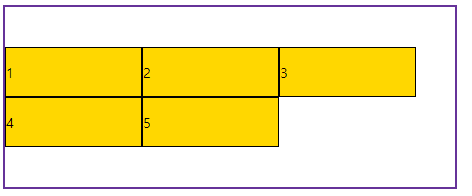
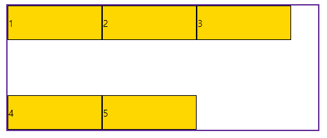
15-8. align-content
요소들이 두 줄 이상일 때의 교차 축(cross axis) 정렬방식을 설정.
flex-wrap의 값을 wrap으로 설정.
예)
<head> <title>flex레이아웃4</title> <style> .wrapper { width: 500px; height: 200px; margin: 0 auto; border: 3px solid rebeccapurple; } .wrapper div { width: 150px; border: 2px solid black; background-color: gold; } #container { display: flex; flex-wrap: wrap; align-content: } </style> </head> <body> <h2>flex레이아웃4</h2> <div id="container" class="wrapper"> <div id="box1"> <p>1</p> </div> <div id="box2"> <p>2</p> </div> <div id="box3"> <p>3</p> </div> <div id="box4"> <p>4</p> </div> <div id="box5"> <p>5</p> </div> </div> </body> |
align-content: stretch: 기본값. 수직축 방향으로 늘어남.
align-content: flex-start: 시작점으로 정렬.
align-content: flex-end: 끝점으로 정렬.
align-content: center: 가운데 정렬.
align-content: space-between: 요소 사이에 여유공간을 두고 배치.(앞뒤 양쪽에 요소를 붙임)
align-content: space-around: 요소 사이에 여유공간을 두고 배치.(앞뒤 약간의 공간을 둠)

15-9. flex-basis
요소의 기본 크기 설정.
15-10. flex-grow
요소를 flex-basis의 설정값보다 커질 때의 비율을 결정하는 속성.
15-11. flex-shrink
요소를 flex-basis의 설정값보다 작아질 때의 비율을 결정하는 속성.
15-12. flex
flex-basis, flex-grow, flex-shrink를 한 번에 설정.
16. 미디어 쿼리 (media query)
CSS에서 사용되는 기술로, 화면의 크기나 해상도, 장치 종류 등과 같은 특정 미디어의 속성에 따라 스타일을 조건부로 적용하는 방법.
미디어 쿼리를 사용하면 다양한 장치에서 웹 페이지를 적절하게 표시할 수 있음.
반응형 웹 하나의 웹사이트에서 PC, 스마트폰, 태블릿 등 접속하는 디스플레이의 종류에 따라 화면의 크기가 자동으로 변하도록 만든 웹페이지 접근 방법. |
| @media 매체유형 and (매체속성 조건) { css 코드 ... } |
매체유형
all: 모든 매체
screen: 컴퓨터, 태블릿, 스마트폰 (구분은 해상도로 함.)
print: 프린터
speech: 스크린 리더
각 매체에 대한 브라우저의 해상도
구형 휴대폰: 320px
일반 휴대폰: 360px ~
태블릿: 768px ~
데스크탑PC: 1024px ~
예)
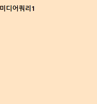
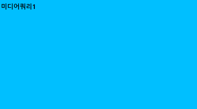
<head> <title>미디어쿼리1</title> <style> body { background-color: bisque; } @media screen and (min-width: 1024px) { body { background-color: deepskyblue; } } </style> </head> <body> <h2>미디어쿼리1</h2> </body> |
화면의 크기가 1024px 아래(min-width: 1024px) 인 경우의 배경색.
화면의 크기가 1024px 이상인 경우의 배경색.
예2)
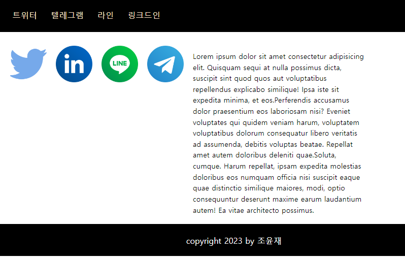
| <head> <title>미디어쿼리2</title> <link rel="stylesheet" href="./media.css"> </head> <body> <div id="container"> <header> <nav> <ul> <li>트위터</li> <li>텔레그램</li> <li>라인</li> <li>링크드인</li> </ul> </nav> </header> </div> <div id="contents"> <section id="intro"> <img src="./twitter.png" alt="트위터"> <img src="./linkedin.png" alt="링크드인"> <img src="./line.png" alt="라인"> <img src="./telegram.png" alt="텔레그램"> </section> <section id="desc" class="text"> <p><span>Lorem ips ..... ..... </p> </section> </div> <footer> <p>copyright 2023 by 조윤재</p> </footer> </body> |
* { margin: 0; padding: 0; box-sizing: border-box; } #container { width: 100; } header { width: 100%; background-color: black; margin-bottom: 20px; } nav > ul { height: 50px; margin: 0; list-style: none; color:bisque; } nav >ul > li { float: left; padding: 10px; margin: 5px 5px; } nav, #contents { width: 320px; margin: 0 auto; } nav > ul { font-size: 12px; } #intro { width: 100%; margin-bottom: 20px; } #intro > img { width: 100%; padding: 10px; } #desc { width: 100%; padding: 10px; line-height: 1.5; font-size: 16px; } footer { width: 100%; height: 50px; padding: 20px; background-color: black; color: white; } footer > p { text-align: center; font-size: 15px; line-height: 12px; } /* 태블릿으로 디스플레이를 확인하려는 경우 (768px~) */ @media screen and (min-width:768px) { nav > ul { font-size: 18px; height: 80px; } nav > ul > li { margin: 20px 5px; } nav, #contents { width: 750px; margin: 0 auto; } #intro { width: 100%; } #intro >img { width: 24%; padding: 10px; } #desc { width: 100%; padding: 10px; margin: 10px auto; } footer { height: 70px; padding: 30px; } footer > p { font-size: 18px; } } /* 데스크탑PC로 디스플레이를 확인하려는 경우 (1024px~) */ @media screen and (min-width: 1024px) { nav, #contents { width: 1000px; margin: 0 auto; } #intro > img { width: 10%; padding: 10px; float: left; } #desc { display: inline-block; width: 400px; height: auto; padding: 10px; } footer { clear: both; } } |
768px, 1024px 등 창의 크기에 따라 화면도 유연하게 바뀜.
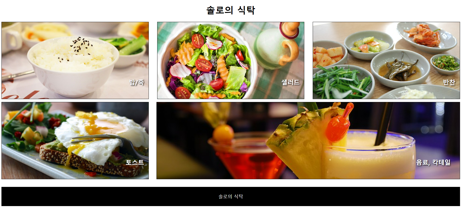
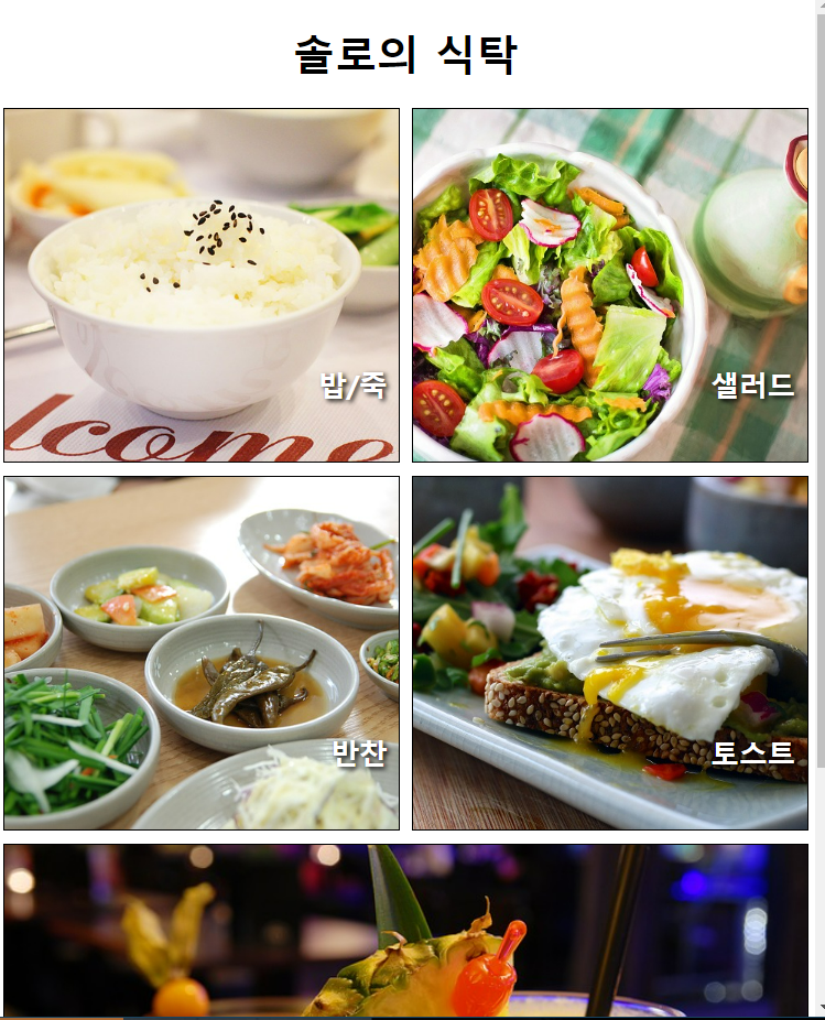
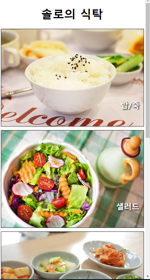
예) 외부 스타일을 이용하여 '솔로의 식탁'이라는 제목으로 음식사진 5장을 삽입해보자.
(휴대폰, 태블릿, 데스크탑PC 화면에서 볼 때, 각각 화면이 아래 사진과 같이 다르게 나타날 수 있도록 함)
<head> <title>솔로의식탁</title> <link rel="stylesheet" href="./css/style.css"> </head> <body> <div id="container"> <header> <h1>솔로의 식탁</h1> </header> <section id="menus"> <div id="menu1"> <h2>밥/죽</h2> </div> <div id="menu2"> <h2>샐러드</h2> </div> <div id="menu3"> <h2>반찬</h2> </div> <div id="menu4"> <h2>토스트</h2> </div> <div id="menu5"> <h2>음료, 칵테일</h2> </div> </section> <footer> <p>솔로의 식탁</p> </footer> </div> </body> |
#container { width: 100%; } header { width: 100%; } header > h1 { text-align: center; font-size: 3em; /* 1em은 PC:16px, Mobile:12px이 기본값이므로, 3em은 해당 기본값에 3을 곱한 값이다. */ } #menus { width: 100%; } #menus>div { height: 400px; border: 1px solid black; margin-bottom: 15px; position: relative; } #menus h2 { position: absolute; right: 3%; bottom: 10%; font-size: 2em; color: white; text-shadow: 3px 3px 5px black; } #menu1, #menu2, #menu3, #menu4, #menu5 { width: 100%; } #menu1 { background: url(../images/dish1.jpg) no-repeat center; background-size: cover; /* 창을 늘릴 때 background의 사진도 함께 늘어남. */ } #menu2 { background: url(../images/dish2.jpg) no-repeat center; background-size: cover; /* 창을 늘릴 때 background의 사진도 함께 늘어남. */ } #menu3 { background: url(../images/dish3.jpg) no-repeat center; background-size: cover; /* 창을 늘릴 때 background의 사진도 함께 늘어남. */ } #menu4 { background: url(../images/dish4.jpg) no-repeat center; background-size: cover; /* 창을 늘릴 때 background의 사진도 함께 늘어남. */ } #menu5 { background: url(../images/dish5.jpg) no-repeat center; background-size: cover; /* 창을 늘릴 때 background의 사진도 함께 늘어남. */ } footer { width: 100%; background-color: black; height: 100px; } footer>p { font-size: 1.5em; color: white; text-align: center; line-height: 100px; } @media screen and (min-width: 768px) { #menus { display: flex; /* 일렬로 정렬 */ flex-wrap: wrap; /* 넘치면 내려가도록 */ justify-content: space-between; } #menu1, #menu2, #menu3, #menu4 { width: 49%; /* 마진이 있기 때문에 100%의 절반인 50%를 정확히 줄 수 없음 */ } } @media screen and (min-width: 1024px) { #menu1, #menu2, #menu3, #menu4 { width: 32%; /* 마진이 있기 때문에 100%의 1/3인 33%를 정확히 줄 수 없음 */ } #menu5 { width: 66%; or flex-basis: 0; flex-grow: 2; flex-shrink: 1; margin-left: 1.7%; } } |


