
4-1. font-size 속성
4-2. font-family 속성
4-3. font-weight 속성
5-1. background-color 속성
5-2. background-image 속성
5-3. background-repeat 속성
5-4. background-position 속성
5-5. background-attachment 속성
5-6. background-size 속성
5-7. background 속성
6-1. 내용(content)
6-2. 패딩(padding)
6-3. 테두리(border)
6-4. 마진(margin)
8-1. none
8-2. block
8-3. inline
8-4. inline-block
10-1. static
10-2. relative
10-3. fixed
10-4. sticky
10-5. absolute
4. CSS 폰트
4-1. font-size 속성
텍스트 크기를 설정.
단위 : px(픽셀), %(퍼센트), em, rem
em : 현재 선택된 요소의 폰트크기를 기준으로 상대적인 크기를 지정.
예) 부모요소의 폰트크기가 16px일때, 자식요소의 폰트크기를 1.5em으로 지정하면 24px가 됨.
rem : 루트요소(html)의 폰트크기를 기준으로 상대적인 크기를 지정.
일괄적인 폰트크기의 조정에 유용.
예) 루트요소의 폰트크기가 16px일때, 자식요소의 폰트크기를 1.5rem으로 지정하면 24px가 됨.
4-2. font-family 속성
텍스트 글꼴을 설정.
글꼴을 선택하는 방법?
* 설치되어있는 기본 글꼴을 사용. (예쁜 디자인이 쉽지 않음)
* 이미지로 처리.
* 클라이언트에 글꼴을 다운로드하여 사용.
* 웹 폰트를 사용. (글꼴을 선택할 때, 교육 간 사용하게 될 방법.)
* 폰트 참고 사이트
Google Fonts: https://fonts.google.com/?subset=korean¬o.script=Kore
Google Fonts
Making the web more beautiful, fast, and open through great typography
fonts.google.com
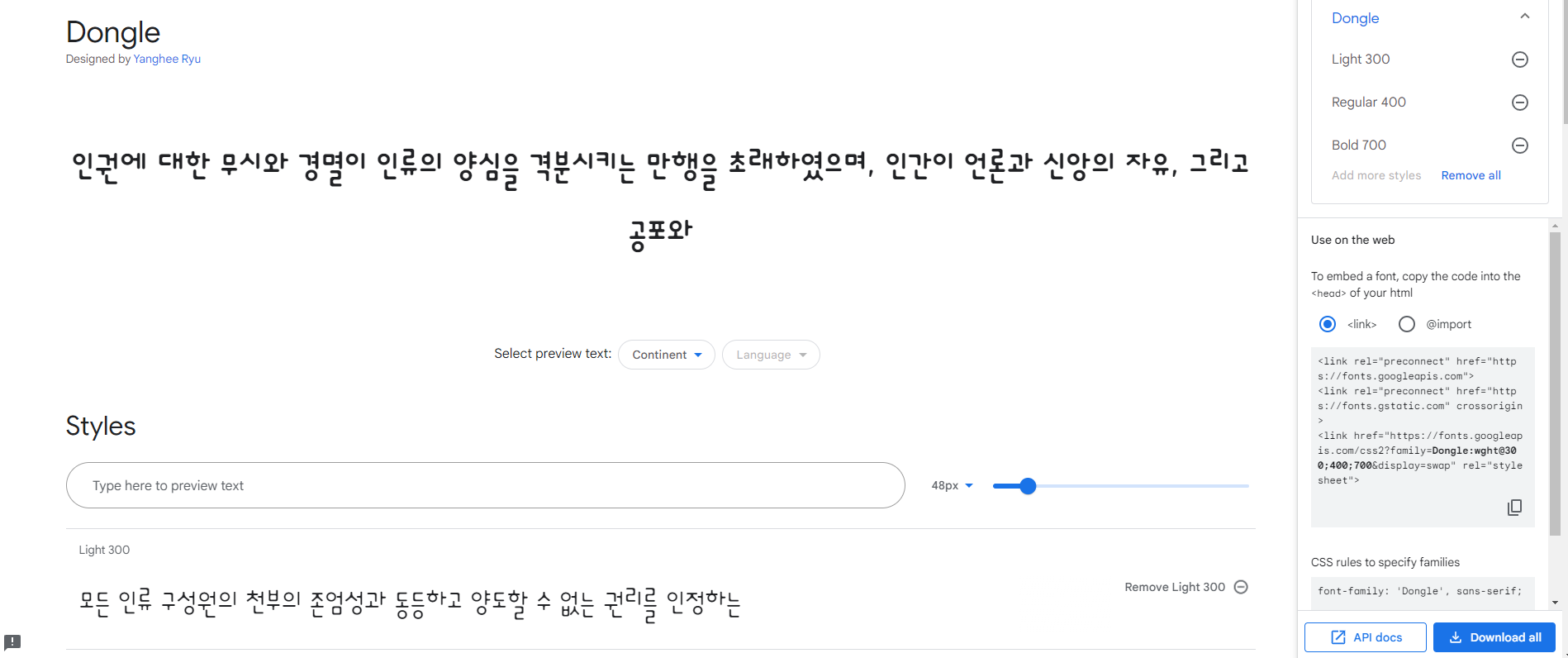
Google Fonts에서 폰트를 선택.
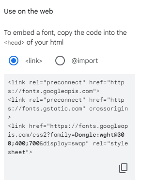
우측의 첫번째 코드를 <head> </head> 요소 안에 삽입.
우측의 두번째 코드를 class로 지정 후 <style> </style> 요소 안에 삽입.
예)
<head> <meta charset="UTF-8"> <meta http-equiv="X-UA-Compatible" content="IE=edge"> <meta name="viewport" content="width=device-width, initial-scale=1.0"> <link rel="preconnect" href="https://fonts.googleapis.com"> <link rel="preconnect" href="https://fonts.gstatic.com" crossorigin> <link href="https://fonts.googleapis.com/css2?family=Dongle:wght@300;400;700&display=swap" rel="stylesheet"> <title>css텍스트</title> <style> p {font-size: 40px;} .dongle1 {font-family: 'Dongle', sans-serif; font-weight: 300;} .dongle2 {font-family: 'Dongle', sans-serif; font-weight: 400;} .dongle3 {font-family: 'Dongle', sans-serif; font-weight: 700;} </style> </head> <body> <h2>css텍스트</h2> <p>모든 사람은 인종, 피부색, 성, 언어, 종교, 정치적 또는 기타의 견해, 민족적 또는 사회적 출신, 재산, 출생 또는 기타의 신분과 같은 어떠한 종류의 차별이 없이, 이 선언에 규정된 모든 권리와 자유를 향유할 자격이 있다.</p> <p class="dongle1">모든 사람은 인종, 피부색, 성, 언어, 종교, 정치적 또는 기타의 견해, 민족적 또는 사회적 출신, 재산, 출생 또는 기타의 신분과 같은 어떠한 종류의 차별이 없이, 이 선언에 규정된 모든 권리와 자유를 향유할 자격이 있다.</p> <p class="dongle2">모든 사람은 인종, 피부색, 성, 언어, 종교, 정치적 또는 기타의 견해, 민족적 또는 사회적 출신, 재산, 출생 또는 기타의 신분과 같은 어떠한 종류의 차별이 없이, 이 선언에 규정된 모든 권리와 자유를 향유할 자격이 있다.</p> <p class="dongle3">모든 사람은 인종, 피부색, 성, 언어, 종교, 정치적 또는 기타의 견해, 민족적 또는 사회적 출신, 재산, 출생 또는 기타의 신분과 같은 어떠한 종류의 차별이 없이, 이 선언에 규정된 모든 권리와 자유를 향유할 자격이 있다.</p> </body> |
눈누 : https://noonnu.cc/
눈누
상업용 무료한글폰트 사이트
noonnu.cc
4-3. font-weight 속성
텍스트 굵기를 설정.
범위: 100 ~ 900 (기본 굵기: 400 )
5. CSS 배경
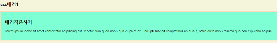
5-1. background-color 속성
배경색을 설정.
상속 가능한 요소.
예)
| <head> <style> body { background-color: beige; } div { background-color: aquamarine; width: 60%; padding: 20px; border: 3px solid peachpuff; } </style> </head> <body> <h2>css배경1</h2> <div> <h2>배경적용하기</h2> <p>Lorem ipsum, dolor sit amet consectetur adipisicing elit. Tenetur cum quod nobis quis culpa et ex! Corrupti suscipit voluptatibus ab quia a, natus dicta nobis minima quo non explicabo adipisci.</p> </div> </body> |
5-2. background-image 속성
배경이미지를 설정.
배경이미지는 기본 설정으로 반복되어서 나타남.
background-image : url (파일의 경로) |
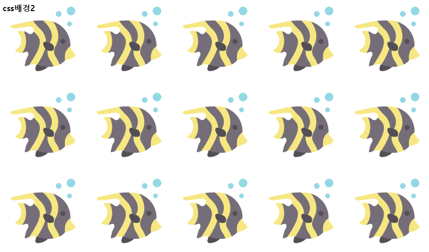
5-3. background-repeat 속성
배경이미지를 수평/수직으로 반복.
reapeat-x, repeat-y, no-repeat
* 배경이미지 참고 사이트
Iconfinder: https://www.iconfinder.com
7,300,000+ free and premium vector icons, illustrations and 3D illustrations
Iconfinder is the world's largest marketplace for icons, illustrations and 3D illustrations in SVG, AI, and PNG format.
www.iconfinder.com
예)
| <head> <style> body { background-image: url(./sea3.png); background-repeat: x-repeat; } </style> </head> <body> <h2>css배경2</h2> </body> |
5-4. background-position 속성
반복되지 않는 배경이미지의 상대위치를 설정.
%나 px을 사용해서 설정.
상대위치 결정기준 : 왼쪽 상단 (left top)
| left top | center top | right top |
| left center | center | right center |
| left bottom | center bottom | right bottom |
background-position : 위의 9개 구역 중에서 선택 ; |
이나,
background-position : (왼쪽에서부터의)가로위치값 (위에서부터의)세로위치값 ; |
로 코드 작성.
5-5. background-attachment 속성
배경이미지를 원하는 위치에 고정. 고정된 이미지는 이동하지 않음.
fixed, scroll
예)
<head> <style> body { background-image: url(./sea3.png); background-repeat: no-repeat; background-position: right bottom; background-attachment: scroll; } div { width: 60%; height: 300px; border: 3px dotted hotpink; padding: 10px; margin-bottom: 20px; background-image: url(./sea3.png); background-repeat: no-repeat; } .bg1 { background-position: center bottom; } .bg2 { background-position: right bottom; } .bg3 { background-position: 20% 100px; } </style> </head> <body> <h2>css배경3</h2> <div class="bg1"> <h2>background-positioin 1</h2> <p>Lorem ipsum dolor sit amet consectetur, adipisicing elit. Natus, harum tempore quo numquam possimus eligendi quam earum! Harum nesciunt excepturi dolore, dolores voluptate sint minus, sequi unde adipisci facilis amet.</p> </div> <div class="bg2"> <h2>background-positioin 2</h2> <p>Lorem ipsum dolor sit amet consectetur adipisicing elit. Molestias corrupti, et totam porro natus cumque quis, officiis sit officia, laboriosam vero ipsam neque earum illum nostrum. Ipsa, harum autem! Numquam!</p> </div> <div class="bg3"> <h2>background-positioin 3</h2> <p>Lorem ipsum dolor sit, amet consectetur adipisicing elit. Officia reprehenderit ducimus natus, incidunt in possimus veritatis blanditiis sapiente molestias, eos consequuntur vel itaque totam, quam nulla quos minima reiciendis voluptatibus!</p> </div> </body> |

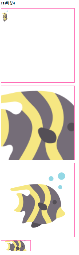
5-6. background-size 속성
배경이미지 크기 조절.
px, %, contain, cover
contain: 배경이미지를 요소 안에 맞춰 들어가도록 조절.
cover: 배경이미지가 요소를 완전히 덮도록 조절.
예)
| <head> <style> div { background-image: url(sea3.png); background-repeat: no-repeat; width: 500px; height: 500px; border: 2px solid hotpink; margin-bottom: 20px; } .background1 { background-size: 50px 100px; } .background2 { background-size: 1000px 1000px; background-position: center; } .background3 { background-size: contain; } .background4 { width: 200px; height: 70px; background-position: center; background-size: cover; } </style> </head> <body> <h2>css배경4</h2> <div class="background1"></div> <div class="background2"></div> <div class="background3"></div> <div class="background4"></div> </body> |
5-7. background 속성
배경속성을 전체에 적용.
예)
| <html> <head> <style> html { background: url(./kong1.jpg) no-repeat center fixed; background-size: cover; } </style> </head> <body> ... </body> ... </html> |
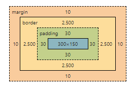
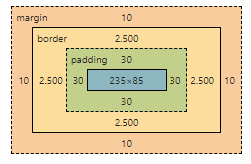
6. 박스 모델 (Box Model)
HTML 요소가 차지하는 공간을 정의하는 모델.
박스 모델은 HTML 요소를 내용, 패딩, 테두리, 마진으로 구분.
6-1. 내용(content)
요소의 실제 내용이 위치.
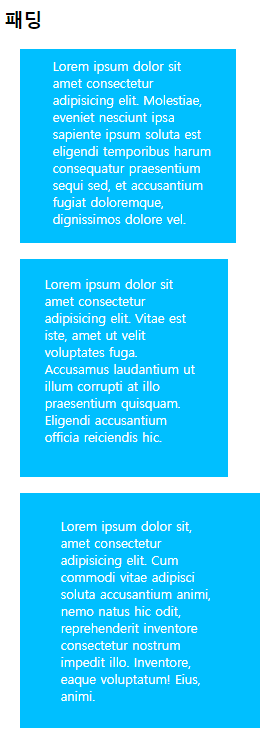
6-2. 패딩(padding)
내용을 감싸는 공간. 내용과 테두리 사이의 간격.
padding: 기본적으로 '위 오른쪽 아래 왼쪽' 순. 요소의 숫자에 따라 순서가 달라짐.
padding : 위 오른쪽 아래 왼쪽 ; |
위 20px, 오른쪽 50px, 아래 30px, 왼쪽 10px
div # padding {padding: 20px 50px 30px 10px;}
위 20px, 오른쪽왼쪽 50px, 아래 30px
div # padding {padding: 20px 50px 30px;}
위아래 20px, 오른쪽왼쪽 50px
div # padding {padding: 20px 50px;}
위아래오른쪽왼쪽 20px
div # padding {padding: 20px;}
예)
| <head> <style> div { width: 200px; height: auto; background-color: deepskyblue; margin: 20px; color: white; } #padding1 { padding: 10px 30px 20px 40px; } #padding2 { padding: 20px 30px 40px; } #padding3 { padding: 30px 50px; } </style> </head> <body> <h2>패딩</h2> <div id="padding1"> Lorem ipsum dolor sit amet consectetur adipisicing elit. Molestiae, eveniet nesciunt ipsa sapiente ipsum soluta est eligendi temporibus harum consequatur praesentium sequi sed, et accusantium fugiat doloremque, dignissimos dolore vel </div> <div id="padding2"> Lorem ipsum dolor sit amet consectetur adipisicing elit. Vitae est iste, amet ut velit voluptates fuga. Accusamus laudantium ut illum corrupti at illo praesentium quisquam. Eligendi accusantium officia reiciendis hic. </div> <div id="padding3"> Lorem ipsum dolor sit, amet consectetur adipisicing elit. Cum commodi vitae adipisci soluta accusantium animi, nemo natus hic odit, reprehenderit inventore consectetur nostrum impedit illo. Inventore, eaque voluptatum! Eius, animi. </div> </body> |
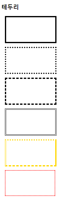
6-3. 테두리(border)
'요소의 경계'가 테두리의 위치.
border-style, border-color, border-width, border 등.
예)
| <head> <style> div { width: 200px; height: 100px; margin: 15px; border-width: 5px; color: black; } #border1 { border-style: solid; } #border2 { border-style: dotted; } #border3 { border-style: dashed; } #border4 { border-style: double; } #border5 { border-color: gold; border-top-style: dotted; border-right-style: solid; border-bottom-style: dashed; border-left-style: double; } #border6 { border: 3px dotted red; } </style> </head> <body> <h2>테두리</h2> <div id="border1"></div> <div id="border2"></div> <div id="border3"></div> <div id="border4"></div> <div id="border5"></div> <div id="border6"></div> </body> |
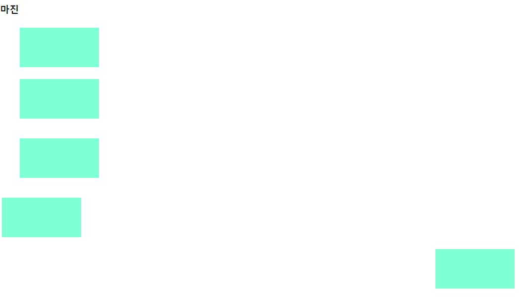
6-4. 마진(margin)
요소와 주변요소간의 간격. 실제로 눈에 보이지 않음.
'세로겹침 현상'이 발생.
(A박스의 마진이 20이고, B박스의 마진이 10일 때, A와 B가 세로로 나열될 경우 마진은 둘 중 큰 값인 20이다.)
가로는 겹침현상이 없어 양 마진의 합으로 나타남.
<head> <style> body {padding: 0; margin: 0;} div { width: 200px; height: 100px; background-color: aquamarine; } #margin1 {margin: 30px 50px 30px 50px;} #margin2 {margin: 30px 50px} #margin3 {margin: 50px;} #margin4 {margin: 30px 5px 10px;} #margin5 {margin: 30px auto;} </style> </head> <body> <h2>마진</h2> <div id="margin1"></div> <div id="margin2"></div> <div id="margin3"></div> <div id="margin4"></div> <div id="margin5"></div> </body> |
7. 박스 사이징(box sizing)
박스 모델의 크기를 결정하는 방법.
width, height 값에 padding, border 영역은 포함되지 않음.
만약 width가 100%로 설정되는 경우 padding, border 속성을 추가할 수 없음.
박스 사이징 속성값을 border box로 설정하면, width와 height값에 padding과 border를 포함.
content-box: 박스의 크기 = 내용영역의 크기
border-box: 박스의 크기 = 내용영역 + 테두리까지 포함한 크기
예)
| <head> <style> div { width: 300px; height: 150px; margin: 10px; padding: 30px; border: 3px solid rebeccapurple; } #boxsizing1 { box-sizing: content-box; } #boxsizing2 { box-sizing: border-box; } </style> </head> <body> <h2>박스사이징</h2> <div id="boxsizing1"> box-sizing = 'content-box'</div> <div id="boxsizing2"> box-sizing = 'border-box'</div> </body> |
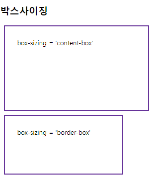
▲ content-box의 box-sizing.
▲ border-box의 box-sizing.
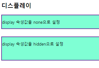
8. CSS 디스플레이
웹페이지의 레이아웃,크기,위치를 제어.
visibility: hidden; (화면에서 사라지는 속성)
visibility: visible; (화면에서 보이는 속성)
8-1. none
요소를 화면에서 '숨김'으로 설정.
8-2. block
요소를 블록레벨요소로 설정.
요소가 한 줄 전체를 차지하며, 다음 요소는 줄바꿈하여 표현됨.
8-3. inline
요소가 텍스트 내에서 표시.
다음 요소는 같은 줄에 이어서 표시.
weight, height 요소의 지정이 불가능.
8-4. inline-block
요소를 인라인블록요소로 설정.
예)
<head> <style> div { background-color: aquamarine; border: 3px solid rebeccapurple; margin-bottom: 30px; } p#none { display: none; } p#hidden { visibility: hidden; } </style> </head> <body> <h2>디스플레이</h2> <div> <p>display 속성값을 none으로 설정</p> <p id="none">display 속성값을 none으로 설정</p> </div> <div> <p>display 속성값을 hidden으로 설정</p> <p id="hidden">visibility 속성값을 hidden으로 설정</p> </div> </body> |
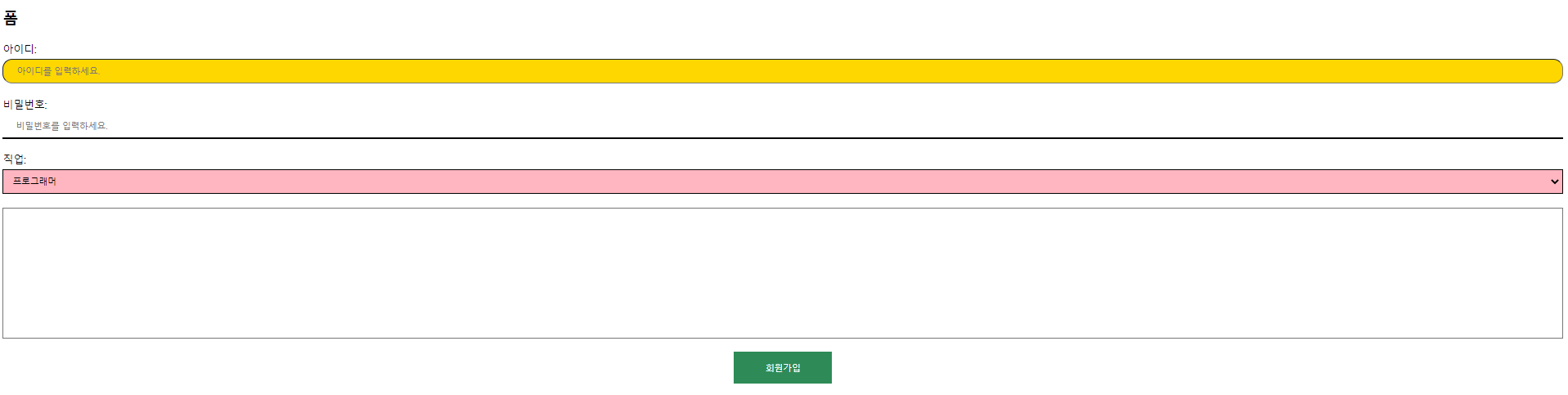
9. CSS 폼
폼요소의 스타일 설정.
예)
| <head> <style> .input{ box-sizing: border-box; width: 100%; background-color: gold; padding: 10px 20px; margin: 5px 0; } input[type='text'] { border-radius: 15px; } input[type='text']:focus { background-color: bisque; border: 3px dotted black; } input[type='password'] { border: none; background-color: white; border-bottom: 3px solid black; } select{ box-sizing: border-box; width: 100%; padding: 10px; background-color: lightpink; margin: 5px 0; border: 2px solid black; } textarea#content { box-sizing: border-box; width: 100%; height: 200px; resize: none; font-size: 40px; } button.btn { width: 150px; background-color: seagreen; color: white; padding: 15px 30px; cursor:grab; border: none; } p.center { text-align: center; } </style> </head> <body> <h2>폼</h2> <form action="#"></form> <p>아이디:<input type="text" id="userid" class="input" maxlength="20" placeholder="아이디를 입력하세요."></p> <p>비밀번호:<input type="password" id="userpw" class="input" maxlength="20" placeholder="비밀번호를 입력하세요."></p> <p>직업: <select name="" id=""> <option value="프로그래머">프로그래머</option> <option value="가수">가수</option> <option value="유튜버">유튜버</option> <option value="화가">화가</option> <option value="래퍼">래퍼</option> </select> </p> <p><textarea id="content"></textarea></p> <p class="center"><button class="btn">회원가입</button></p> </body> |
10. CSS 포지션(position)
요소의 위치를 결정하는 방식 설정.
10-1. static
정적 위치 지정방식.
CSS의 기본 위치값.
단순히 웹페이지의 흐름에 따라 차례대로 요소들이 위치를 결정하는 방식.
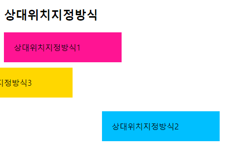
10-2. relative
상대 위치 지정방식.
요소를 '자신이 있던 위치를 기준으로' 상대적으로 이동.
top, left, right, bottom 속성값을 사용.
예)
<head> <style> div { width: 200px; padding: 20px; } .relative1 { background-color: deeppink; } .relative2 { position: relative; background-color: deepskyblue; left: 200px; top: 100px; } .relative3 { position: relative; background-color: gold; right: 100px; bottom: 50px; } </style> </head> <body> <h2>상대위치지정방식</h2> <div class="relative1">상대위치지정방식1</div> <div class="relative2">상대위치지정방식2</div> <div class="relative3">상대위치지정방식3</div> </body> |
10-3. fixed
고정 위치 지정방식.
요소를 뷰포트(viewport) 기준으로 위치를 고정.
스크롤이 되어도 항상 같은 위치에 있음.
스크롤을 따라 움직이는 '배너'와 같은 개념.
top, left, right, bottom 속성값을 사용.
예)
| <head> <style> #fx { position: fixed; width: 100px; height: 200px; background-color: gold; right: 10px; bottom: 10px; } </style> </head> <body> <h2>고정위치지정방식</h2> <div id="fx"></div> <div id="content"> <p>Lorem ipsum dolor sit, amet consectetur adipisicing elit. Recusandae voluptates eveniet doloribus quas eos itaque ad quibusdam animi adipisci, aliquam a quis sit temporibus nisi fugiat unde optio iste voluptate.</p> <p>Lorem ipsum dolor sit, amet consectetur adipisicing elit. Recusandae voluptates eveniet doloribus quas eos itaque ad quibusdam animi adipisci, aliquam a quis sit temporibus nisi fugiat unde optio iste voluptate.</p> <p>Lorem ipsum dolor sit, amet consectetur adipisicing elit. Recusandae voluptates eveniet doloribus quas eos itaque ad quibusdam animi adipisci, aliquam a quis sit temporibus nisi fugiat unde optio iste voluptate.</p> ..... ..... ..... <p>Lorem ipsum dolor sit, amet consectetur adipisicing elit. Recusandae voluptates eveniet doloribus quas eos itaque ad quibusdam animi adipisci, aliquam a quis sit temporibus nisi fugiat unde optio iste voluptate.</p> <p>Lorem ipsum dolor sit, amet consectetur adipisicing elit. Recusandae voluptates eveniet doloribus quas eos itaque ad quibusdam animi adipisci, aliquam a quis sit temporibus nisi fugiat unde optio iste voluptate.</p> </div> </body> |
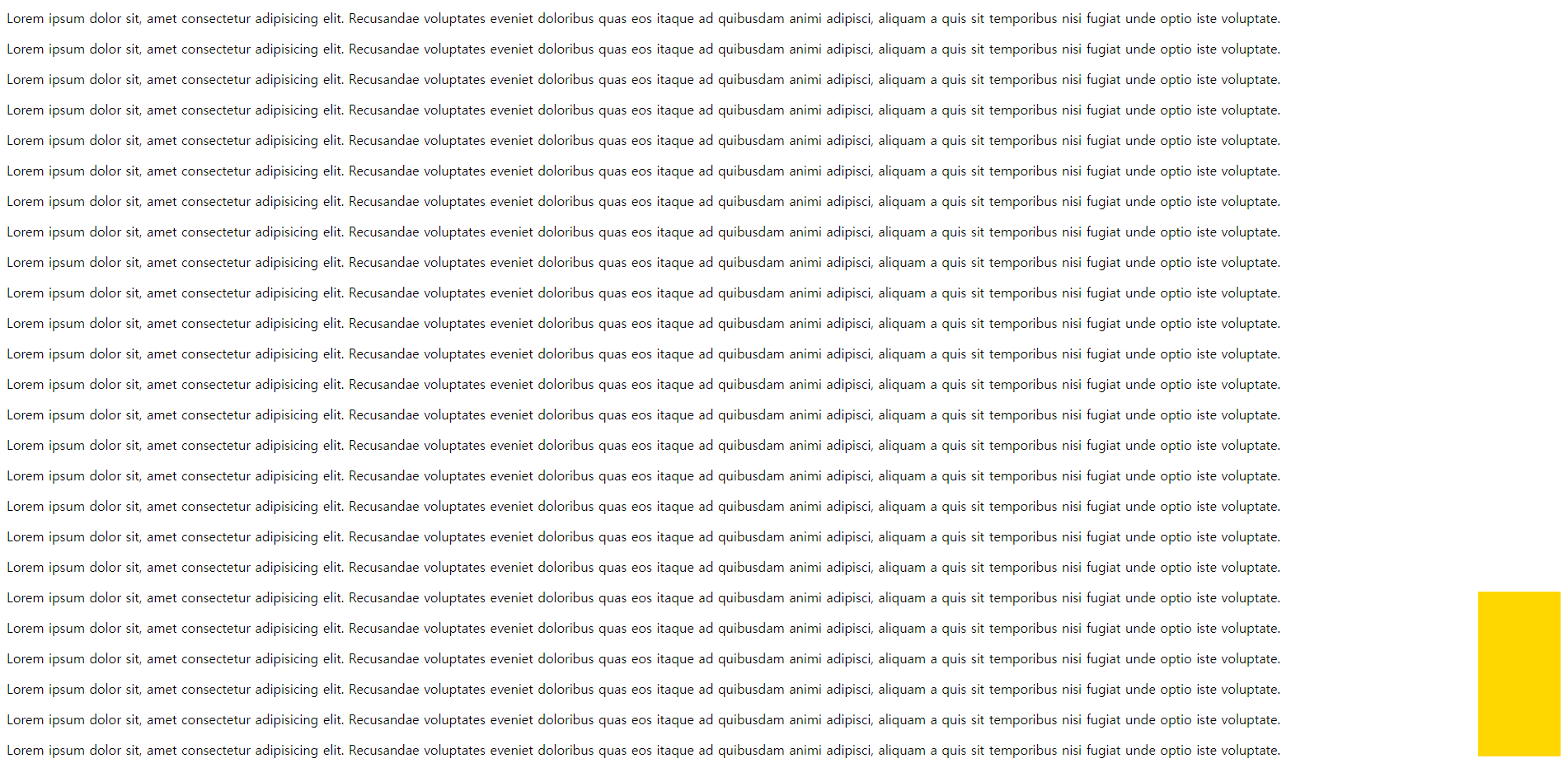
▲ 스크롤을 내려도 오른쪽의 노란박스는 따라간다.
10-4. sticky
부모태그를 이용한 고정 위치 지정방식.
요소가 스크롤 영역의 위치에 따라 상대적인 위치를 가짐.
fixed가 브라우저화면의 절대위치를 사용하는 반면, sticky는 부모태그의 절대위치를 사용.
Explorer 브라우저에서는 작동하지 않음.
예)
| <head> <style> html, body { font-size: 30px; font: bold; margin: 0; padding: 0; } .header { height: 80px; background-color: gold; } .container { display: flex; flex-flow: row nowrap; } .content { box-sizing: border-box; width: 80%; height: 8000px; background-color: deepskyblue; } .sidebar { position: sticky; box-sizing: border-box; width: 20%; background-color: deeppink; height: 100px; top: 10px; /* 상위 부모 container의 가장 상단에서부터 적용 */ } .footer { background-color: aquamarine; height: 2000px; } </style> </head> <body> <header class="header">헤더</header> <main class="container"> <section class="content">메인 컨텐츠</section> <aside class="sidebar">sticky 적용하기</aside> </main> <footer class="footer">푸터</footer> </body> |
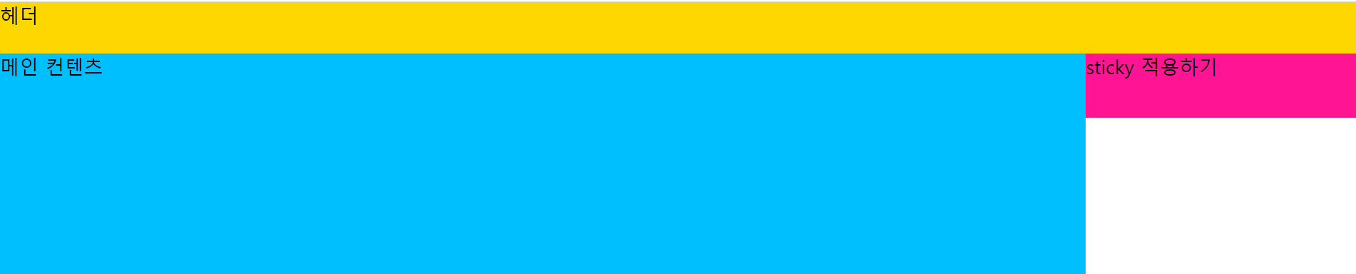
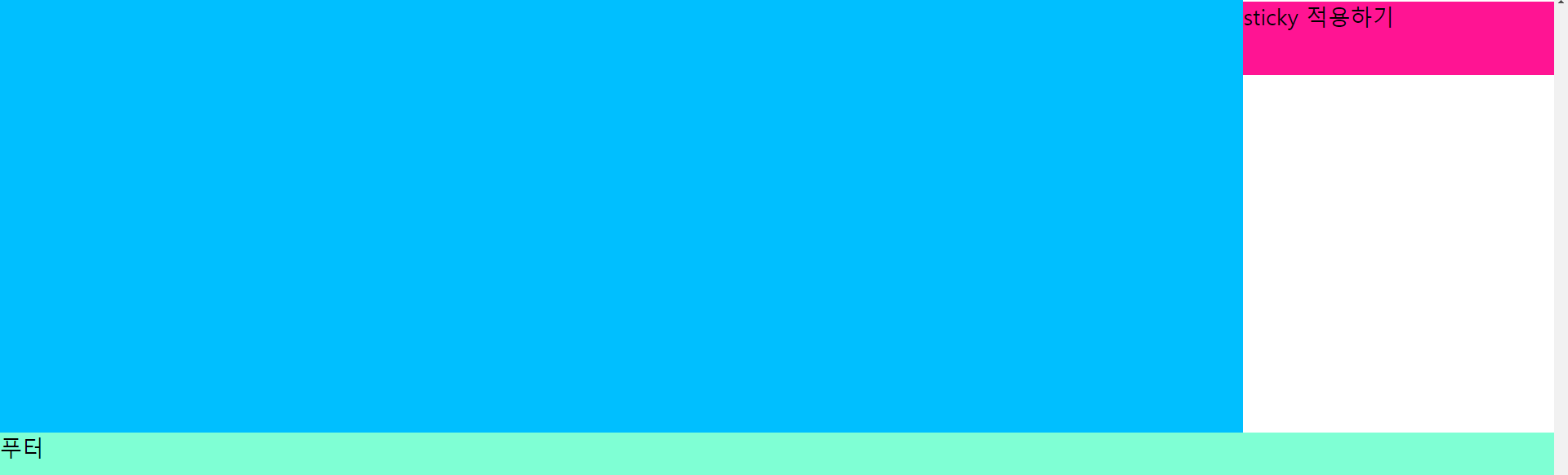
▲ 스크롤을 내려도 오른쪽의 빨간박스는 따라간다.
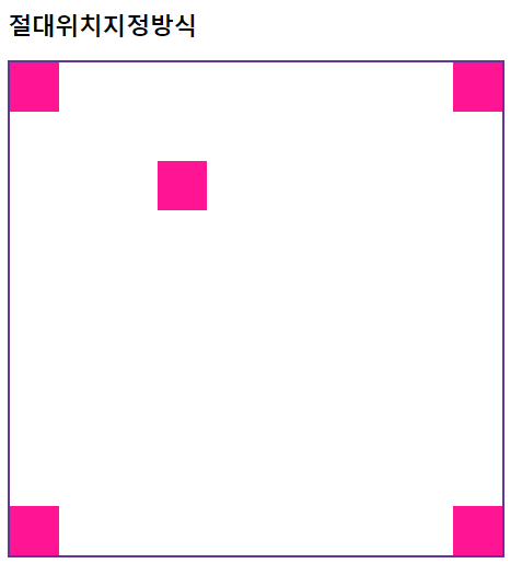
10-5. absolute
절대 위치 지정방식.
요소를 뷰포트(viewport) 기준으로 위치 설정.
조상요소를 기준으로 위치를 지정할 수 있음.
조상요소를 가지지 않으면 body요소를 기준으로 위치를 결정할 수 있음.
조상요소를 기준으로 위치를 결정하기 위해서 조상요소는 static 방식이 아니어야 함.
top, left, right, bottom 속성값을 사용.
예)
| <head> <style> #wrap { position: relative; width: 500px; height: 500px; border: 3px solid rebeccapurple; } .box { position: absolute; width: 50px; height: 50px; background-color: deeppink; } #ab1 { top:0; right: 0; } #ab2 { bottom: 0; left: 0; } #ab3 { bottom: 0; right: 0; } #ab4 { top: 100px; left: 150px; } </style> </head> <body> <h2>절대위치지정방식</h2> <div id="wrap"> <div class="box" id="ab1"></div> <div class="box" id="ab2"></div> <div class="box" id="ab3"></div> <div class="box" id="ab4"></div> <div class="box" id="ab5"></div> </div> </body> |
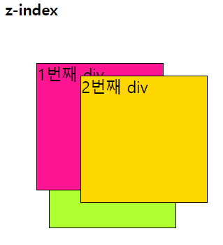
11. z-index
HTML 요소의 위치를 설정하게 되면 위치 및 방식에 따라 요소가 겹칠 수 있음.
겹쳐지는 요소의 쌓임 순서를 결정할 때 사용.
순서는 숫자의 크기가 클수록 위에 위치하고, 작을수록 아래에 위치.
예)
<head> <style> div#wrapper { position: relative; } div.box { position: absolute; width: 200px; height: 200px; border: 1px solid black; font-size: 25px; } #b1 { left: 50px; top: 50px; background-color: deeppink; z-index: 10; } #b2 { left: 120px; top: 70px; background-color: gold; z-index: 100; } #b3 { left: 70px; top: 110px; background-color: greenyellow; z-index: 5; } </style> </head> <body> <h2>z-index</h2> <div id="wrapper"> <div id="b1" class="box">1번째 div</div> <div id="b2" class="box">2번째 div</div> <div id="b3" class="box">3번째 div</div> </div> </body> |
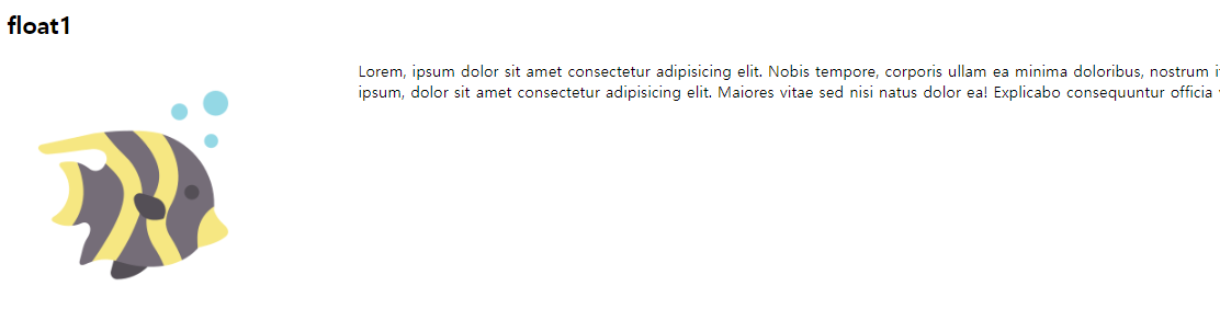
12. float
요소를 좌우방향으로 부유(floating)시키는데 사용.
주로 이미지나 텍스트를 둘러싸는 레이아웃을 구성하는데 사용되며, 다른 요소들과 어떻게 상호작용하는지를 제어.
예를 들어, 이미지에 flaot left, float right를 적용하여 이미지를 좌측 또는 우측으로 부유, 텍스트를 이미지 주위에 감쌈.
float 적용 요소의 다음에 나오는 모든 요소들이 끌어올려짐. float 적용 요소는 다른 요소보다 위쪽에 위치함.
컨텐츠의 크기만큼만 영역을 설정. (블록태그의 성격)
예1)
| <head> <style> img { float: left; margin-right: 100px; } </style> </head> <body> <h2>float1</h2> <img src="./sea3.png" alt="물고기"> Lorem, ipsum dolor sit amet consectetur adipisicing elit. Nobis tempore, corporis ullam ea minima doloribus, nostrum itaque voluptatem sequi dolorem inventore dolorum pariatur. Molestiae, est! Iste, laborum voluptas. Quo, quod? Lorem ipsum, dolor sit amet consectetur adipisicing elit. Maiores vitae sed nisi natus dolor ea! Explicabo consequuntur officia veritatis numquam expedita maxime? Pariatur tempora, nobis beatae a minima excepturi magni? </body> |
예2)
| <head> <style> #box1 { padding: 20px; background-color: gold; float: left; margin-right: 20px; } #box2 { padding: 20px; background-color: deeppink; float: left; } #box3 { padding: 20px; background-color: deepskyblue; float: left; margin-left: 20px; } #box4 { padding: 20px; background-color: greenyellow; float: right; } </style> </head> <body> <h2>float2</h2> <div id="box1">박스-1</div> <div id="box2">박스-2</div> <div id="box3">박스-3</div> <div id="box4">박스-4</div> </body> |

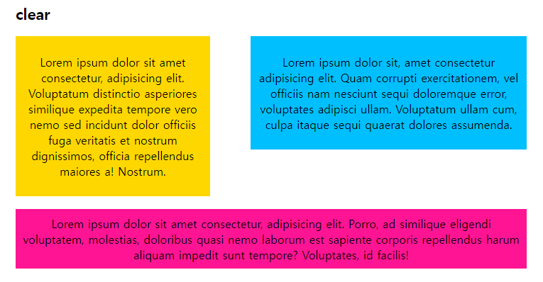
13. clear
float된 요소의 영향을 받지 않도록 하는 속성.
float 속성이 적용된 이후 등장하는 모든 요소들은 정확한 위치를 설정하기 힘듦.
clear 속성을 이용하여 float 이후에 등장하는 요소들이 더이상 float 속성에 영향을 받지 않도록 설정.
left, right, both
예)
| <head> <style> body { margin: 20px 30px; max-width: 800px; } p { padding: 10px; text-align: center; font-size: 18px; } #p1 { float: left; width: 38%; background-color: gold; margin-bottom: 20px; } #p2 { float: right; width: 54%; background-color: deepskyblue; } #p3 { clear: both; background-color: deeppink; } </style> </head> <body> <h2>clear</h2> <div id="p1"> <p>Lorem ipsum dolor sit amet consectetur, adipisicing elit. Voluptatum distinctio asperiores similique expedita tempore vero nemo sed incidunt dolor officiis fuga veritatis et nostrum dignissimos, officia repellendus maiores a! Nostrum.</p> </div> <div id="p2"> <p>Lorem ipsum dolor sit, amet consectetur adipisicing elit. Quam corrupti exercitationem, vel officiis nam nesciunt sequi doloremque error, voluptates adipisci ullam. Voluptatum ullam cum, culpa itaque sequi quaerat dolores assumenda.</p></div> <div id="p3"> <p>Lorem ipsum dolor sit amet consectetur, adipisicing elit. Porro, ad similique eligendi voluptatem, molestias, doloribus quasi nemo laborum est sapiente corporis repellendus harum aliquam impedit sunt tempore? Voluptates, id facilis!</p> </div> </body> |
과제
자신의 웹사이트에 '회원가입 페이지', '로그인 페이지'를 만드는 코드 작성


