9.상권별 업종 밀집 데이터 분석 예제
# 사용할 라이브러리의 추가
import pandas as pd
import numpy as np
import matplotlib.pyplot as plt
import seaborn as sns # matplotlib 기반으로 만들어진 시각화 라이브러리
# 한글이 깨지지않도록 설정 #colab에 나눔체를 설치 → 상단메뉴 '런타임'에서 '다시시작 및 모두실행'을 클릭 !sudo apt-get install -y fonts-nanum !sudo fc-cache -fv !rm ~/.cache/matplotlib -rf # colab에 설치한 글꼴을 설정 plt.rc('font', family='NanumBarunGothic') |
# 받은 파일 가져오기
shop = pd.read_csv('/content/drive/MyDrive/K-DT/python_데이터분석/shop_201806_01.csv')
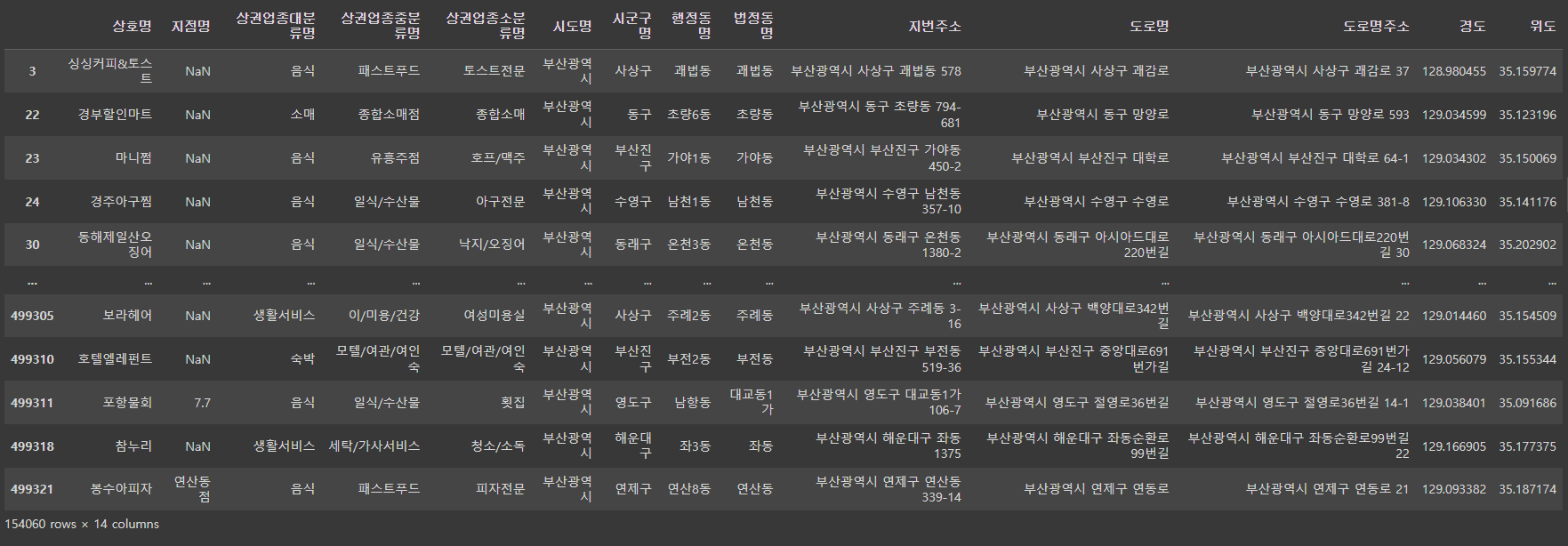
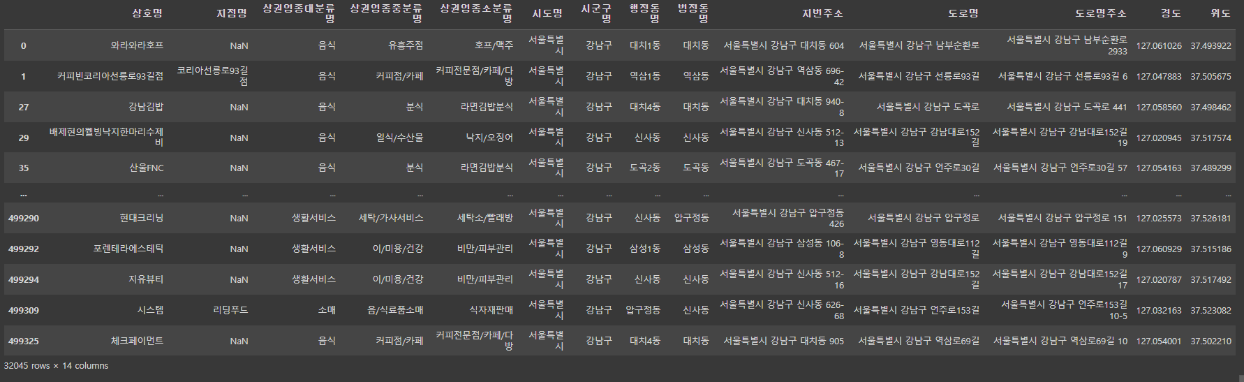
shop
# column이 40개로 보이도록 조절
pd.set_option('display.max_columns', 40)
shop.head()

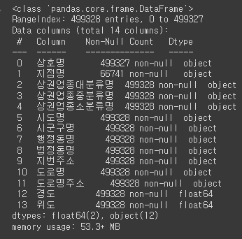
# data의 정보확인
shop.info()
# columns의 추출
shop.columns

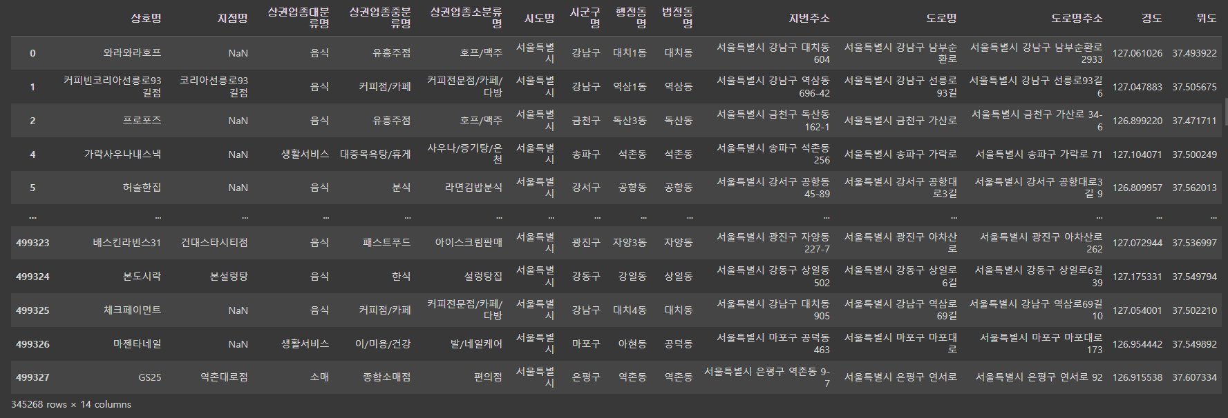
# columns만을 select
view_columns = ['상호명', '지점명', '상권업종대분류명','상권업종중분류명',
'상권업종소분류명','시도명', '시군구명','행정동명', '법정동명','지번주소',
'도로명','도로명주소', '경도', '위도']

shop = shop[view_columns]
shop.head()

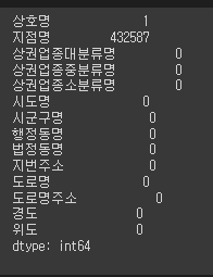
# 결손부분 찾기
shop.isnull().sum()
scatter(): 점그래프의 작성에 사용.
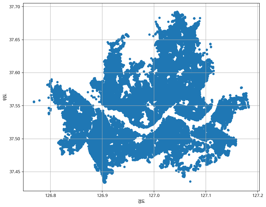
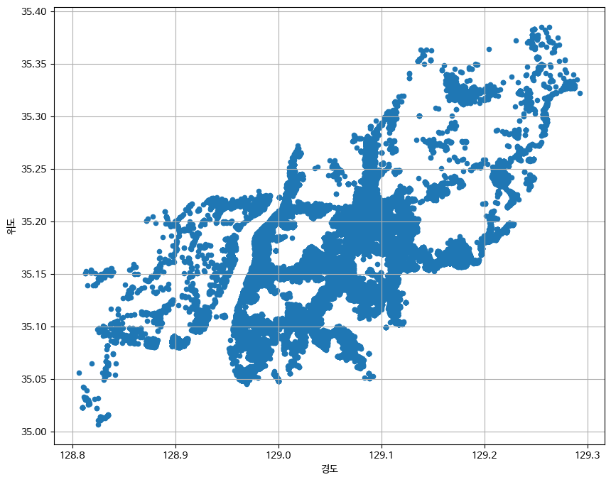
shop.plot.scatter(x='경도', y='위도', grid=True, figsize=(10,14))
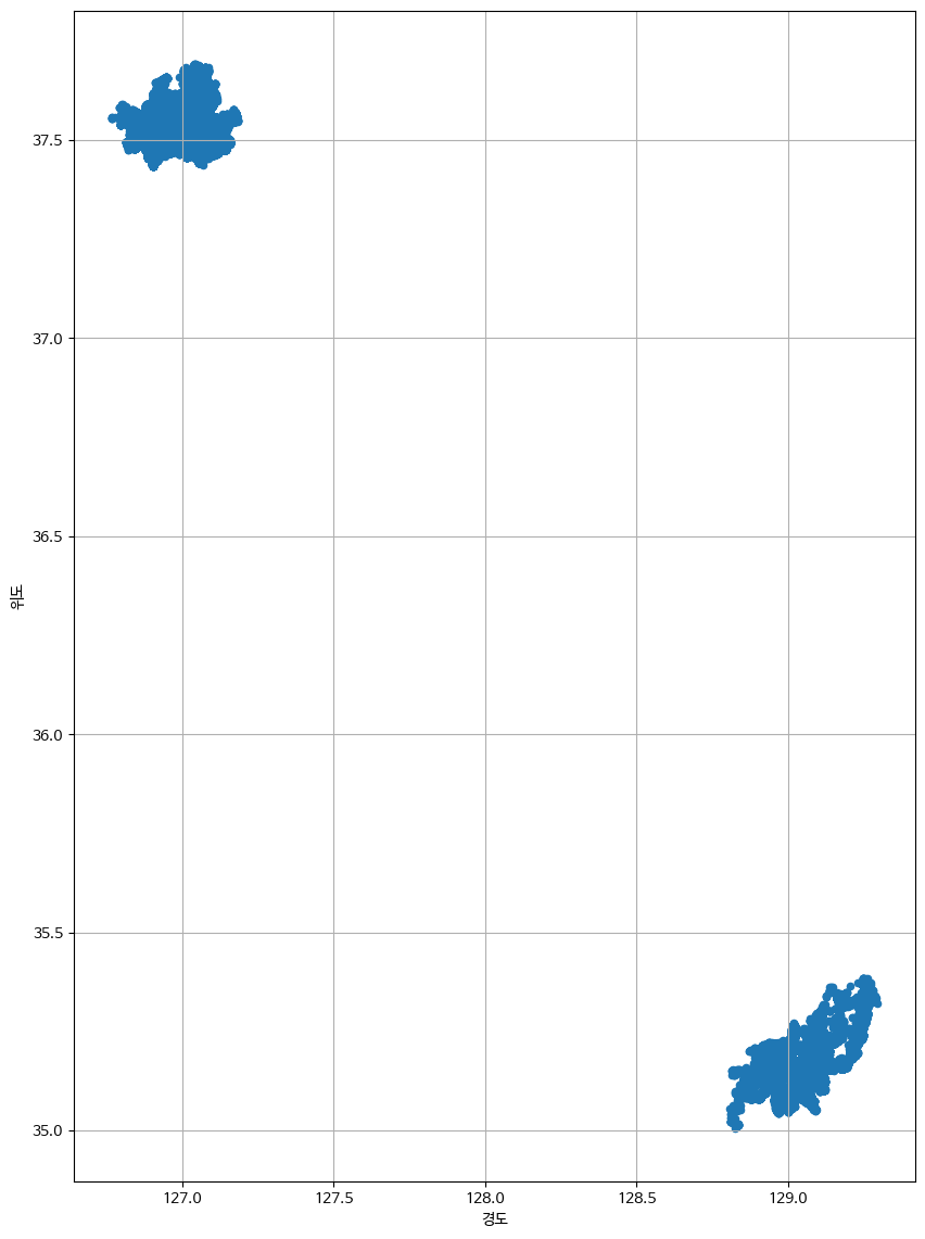
그래프를 보아 상권이 서울과 부산에 밀집되어있다는 것을 알 수 있음.
# 도로명주소가 서울인 data
shop_seoul = shop.loc[shop['도로명주소'].str.startswith('서울')]
shop_seoul
# 도로명주소가 서울이 아닌 data
shop_except_seoul = shop.loc[~shop['도로명주소'].str.startswith('서울')]
shop_except_seoul
# 점그래프로 서울의 상권 파악
shop_seoul.plot.scatter(x='경도', y='위도', grid=True, figsize=(10,8))
# 점그래프로 서울 외의 상권 파악
shop_except_seoul.plot.scatter(x='경도', y='위도', grid=True, figsize=(10,8))
# 구별로 서울 상권 점그래프 분류
plt.figure(figsize=(10,8))
sns.scatterplot(data=shop_seoul, x='경도', y='위도', hue='시군구명')

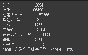
# 상권업종 대분류명의 종류 확인
shop_seoul['상권업종대분류명'].value_counts()
# 위에서 학문/교육만 뽑아서 출력해보기
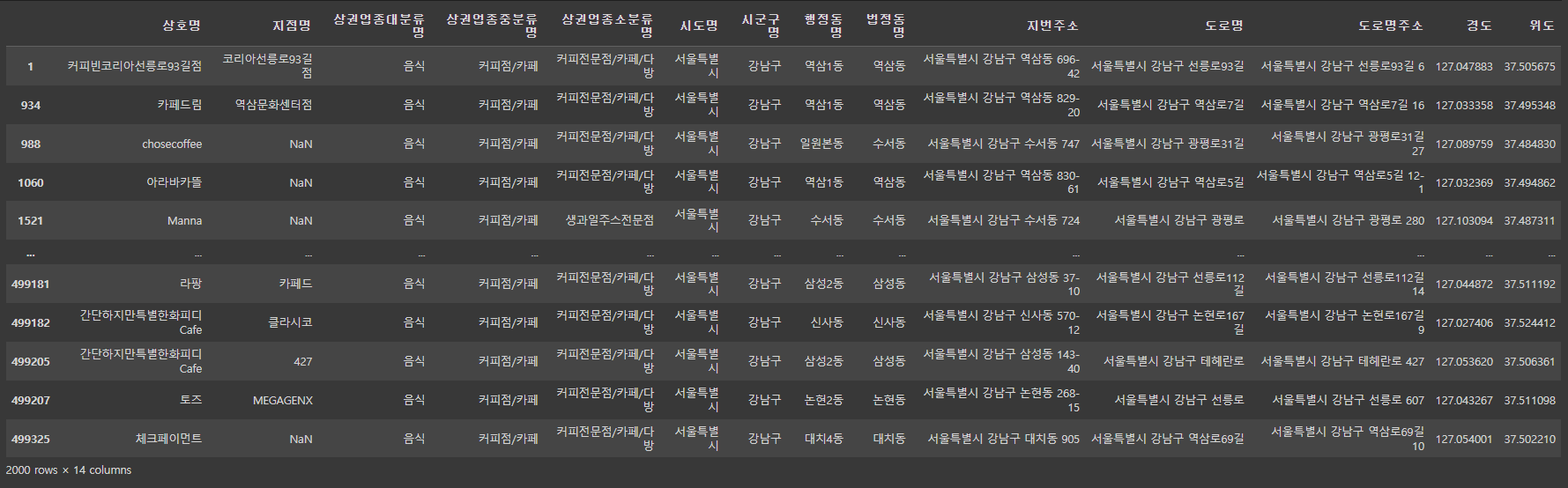
shop_seoul_edu = shop_seoul[shop_seoul['상권업종대분류명'] == '학문/교육']
shop_seoul_edu
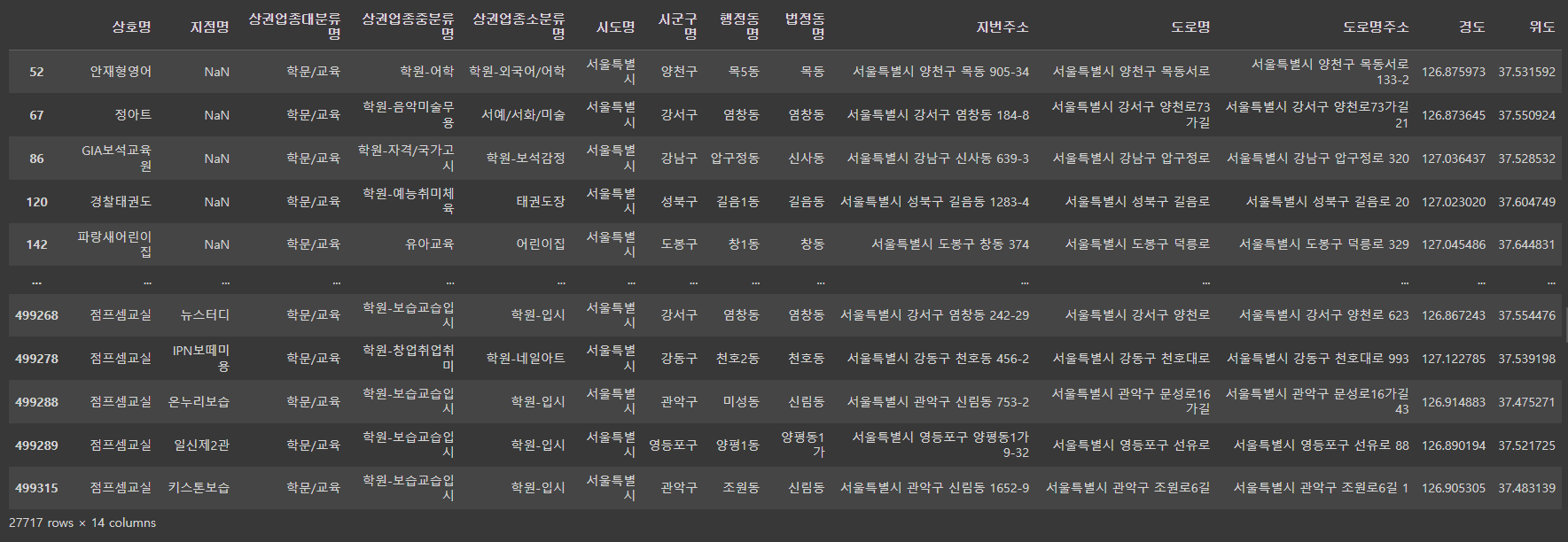
# 위의 data의 shape
shop_seoul_edu.shape # 27717개 data가 14행으로 구성.
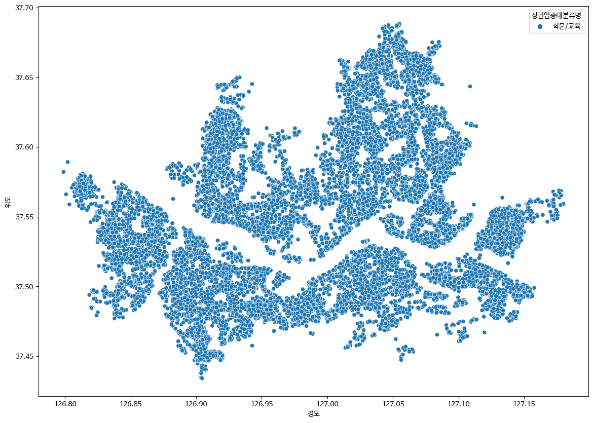
# 상권업종대분류명을 점그래프로 확인
plt.figure(figsize=(14,10))
sns.scatterplot(data=shop_seoul_edu, x='경도', y='위도', hue='상권업종대분류명')
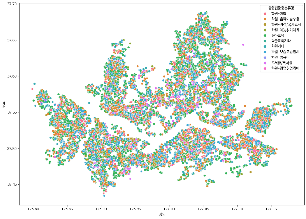
# 상권업종중분류명을 점그래프로 확인
plt.figure(figsize=(14,10))
sns.scatterplot(data=shop_seoul_edu, x='경도', y='위도', hue='상권업종중분류명')
# 상권업종중분류명이 학원-컴퓨터 인 data 출력
shop_seoul_edu_computer = shop_seoul_edu[shop_seoul_edu['상권업종중분류명'] == '학원-컴퓨터']
shop_seoul_edu_computer
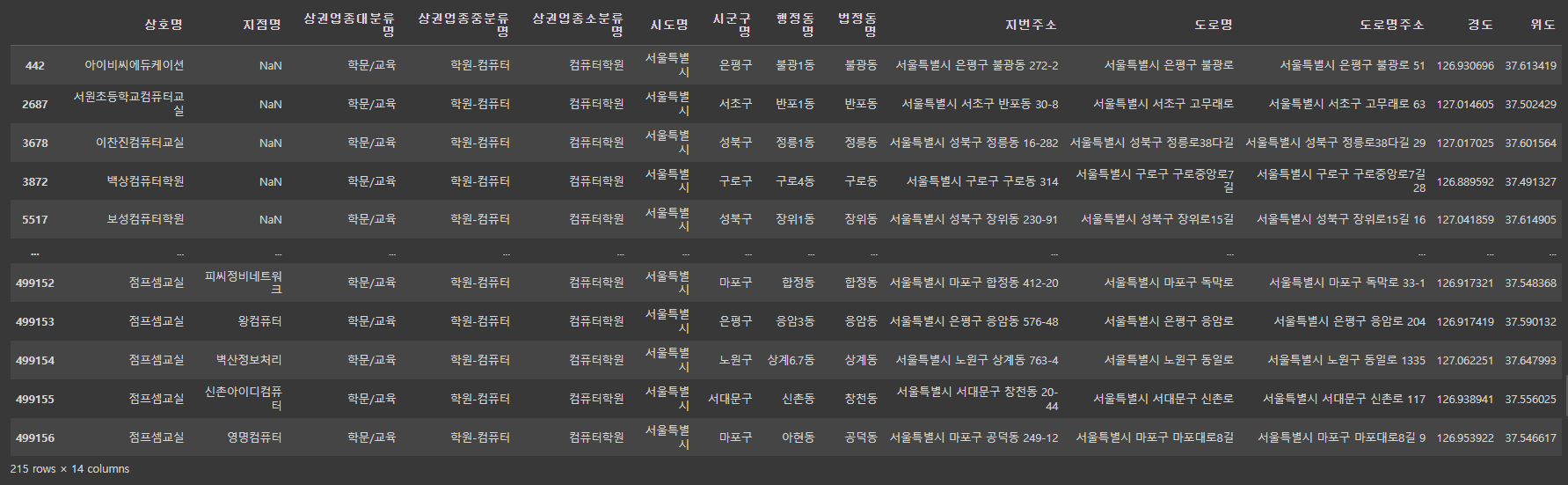
shop_seoul_edu_computer.shape
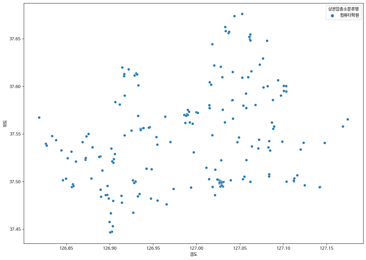
# 상권업종소분류명을 점그래프로 확인
plt.figure(figsize=(14,10))
sns.scatterplot(data=shop_seoul_edu_computer, x='경도', y='위도', hue='상권업종소분류명')
예제
예제1
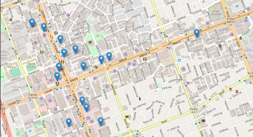
folium으로 shop_seoul_edu_computer의 '컴퓨터학원' 데이터 출력하기
import folium
shop.info()
map = folium.Map(location=[37.50006, 127.0355806], zoom_start=17)

for _, row in shop_seoul_edu_computer.iterrows():
  popup = folium.Popup(row['상호명'], max_width=500)
  folium.Marker(location=[row['위도'], row['경도']], popup=row['상호명']).add_to(map)
map
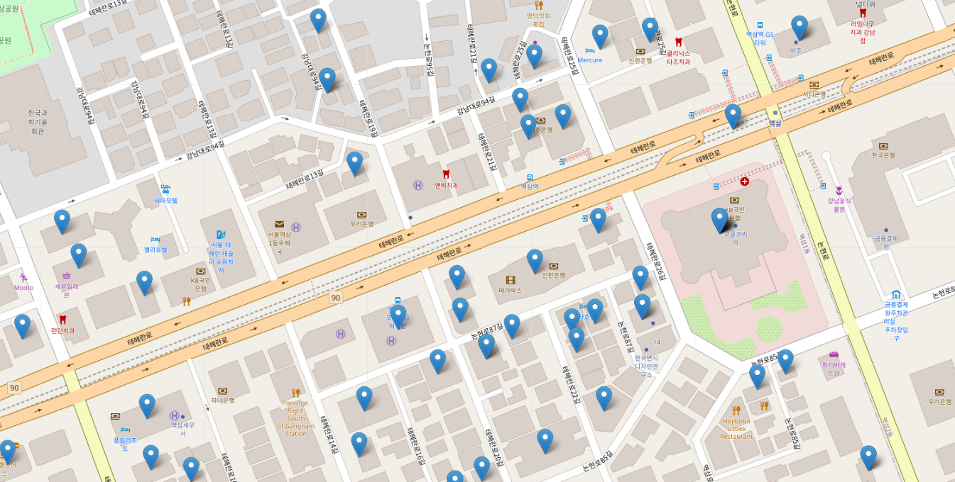
예제2
상권업종중분류명이 '커피점/카페'인 데이터 중 '구군'이 강남구인 데이터만 지도에 표기
shop_gangnam = shop.loc[shop['시군구명'].str.startswith('강남구')]
shop_gangnam
shop_gangnam_cafe = shop_gangnam[shop_gangnam['상권업종중분류명'] == '커피점/카페']
shop_gangnam_cafe
map = folium.Map(location=[37.50006, 127.0355806], zoom_start=20)


for _, row in shop_gangnam_cafe.iterrows():
  popup = folium.Popup(row['상호명'], max_width=500)
  folium.Marker(location=[row['위도'], row['경도']], popup=row['상호명']).add_to(map)
map