
5. 쇼핑몰 데이터 분석 예제
# pandas 모듈 pd로 불러오기
import pandas as pd
# 파일 드라이브 마운트 필요. 이후 파일경로 복사
retail = pd.read_csv('/content/drive/MyDrive/K-DT/python_데이터분석/OnlineRetail.csv')
retail
# data를 위 5개, 아래 5개로 나누어서 가져오기 → 가시성 ▲
pd.options.display.max_rows = 10
retail
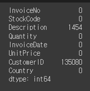
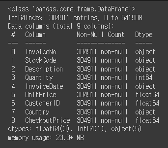
# data의 정보를 확인해보기
retail.info()
#각 필드의 null값의 갯수를 확인
retail.isnull().sum()
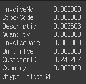
#각 필드당 null값의 퍼센티지를 확인
retail.isnull().mean()
# 비회원을 제거한 후, 전체 길이로 총 data의 양을 체크
retail = retail[pd.notnull(retail['CustomerID'])]

len(retail)

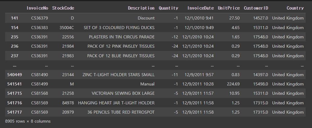
# 수량이 0보다 작거나 같은것이 있는지 체크
retail[retail['Quantity']<=0] # 8905개가 존재
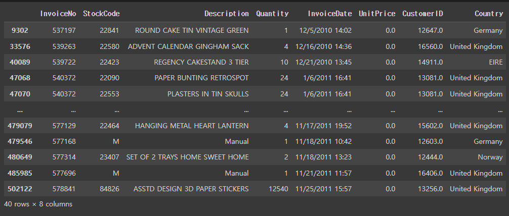
# 구입 가격이 0보다 작거나 같은것이 있는지 체크
retail[retail['UnitPrice']<=0] # 40개가 존재
# 구입 수량이 1이상인 데이터만 저장
retail = retail[retail['Quantity']>=1]
# 구입 가격이 1이상인 데이터만 저장
retail = retail[retail['UnitPrice']>=1]
# 다시한번 총 data의 양을 체크
len(retail)

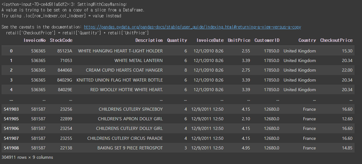
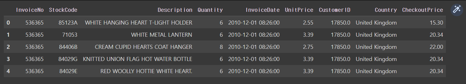
# 고객의 총 지출비용(CheckoutPrice) 파생변수 생성하기
(지출비용 = 수량 * 가격)
retail['CheckoutPrice'] = retail['Quantity'] * retail['UnitPrice']
retail
retail.info()
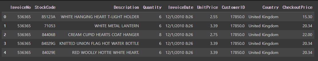
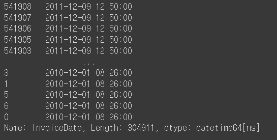
# InvoiceDate의 object타입을 날짜타입으로 변경해보기
retail.head()
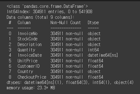
retail['InvoiceDate']=pd.to_datetime(retail['InvoiceDate'])
# 다시 info를 실행하면, dataetime64[ns]로 바뀐걸 확인할 수 있음.
retail.info()
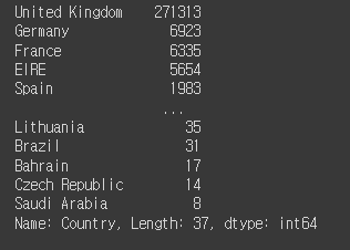
# 매출이 있는 국가의 수 구해보기
retail['Country'].value_counts()
pd.options.display.max_rows = 20
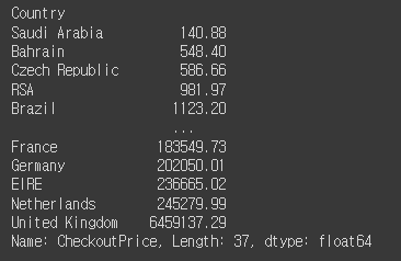
# 국가별 매출합 구해보기
rev_by_countries = retail.groupby('Country')['CheckoutPrice'].sum().sort_values()
rev_by_countries
# sum으로 오름차순을 하고 싶다면, sum().sort_values() 입력.
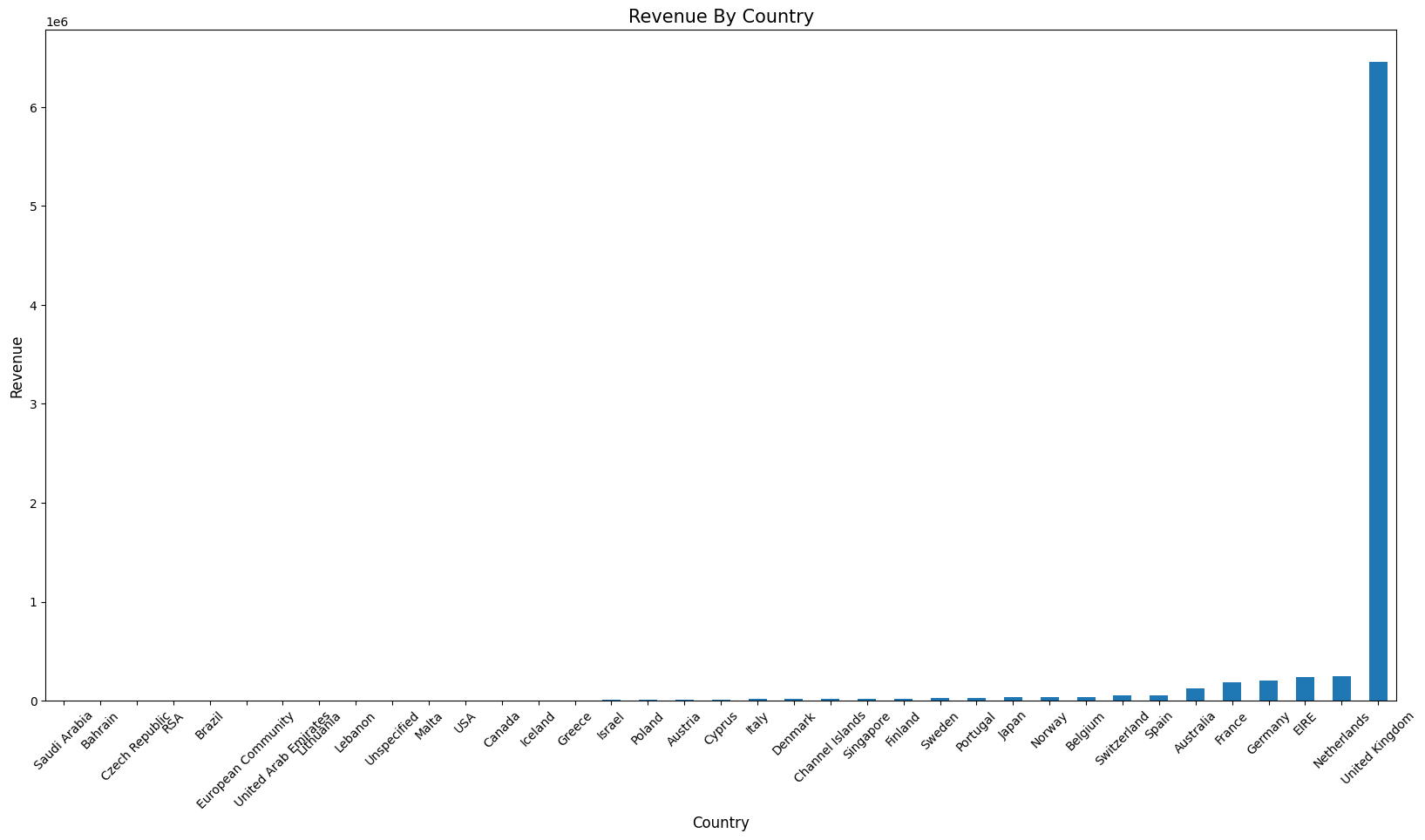
# 국가별 매출을 시각화하기 위해 그래프를 그려보기.
plot = rev_by_countries.plot(kind='bar', figsize=(20,10)) # bar: 막대
plot.set_xlabel('Country', fontsize=12) # label x축 세팅
plot.set_ylabel('Revenue', fontsize=12) # label y축 세팅
plot.set_title('Revenue By Country', fontsize=15) # 제목 세팅
plot.set_xticklabels(labels=rev_by_countries.index, rotation=45)
# x축 눈금선 숫자 세팅. index를 x라벨에 넣어주며 rotation 45를 줌.
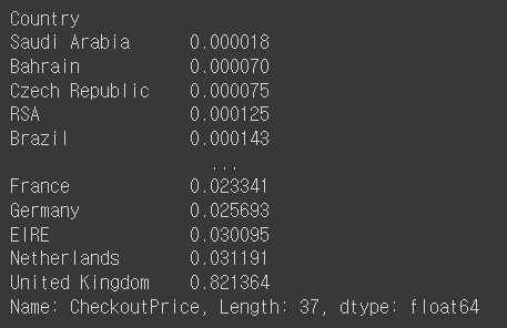
# 각 국가별 매출에 대한 비율
rev_by_countries / total_revenue
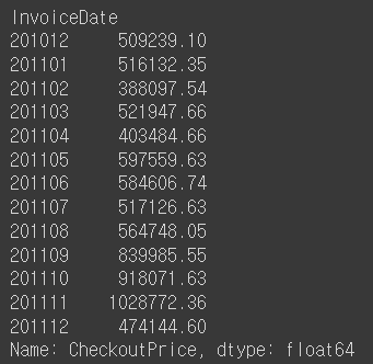
# 월별 매출 구해보기
retail['InvoiceDate'].sort_values(ascending=False)
# 월별 매출을 구하는데 필요한 함수를 만들기
def extract_month(date):
  month = str(date.month) # 3
  if date.month <10:
    month = '0' + month  # 03
  return str(date.year) + month # 201103
# set_index를 이용하여 InvoiceDate로 index를 세팅함.
rev_by_month = retail.set_index('InvoiceDate').groupby(extract_month)['CheckoutPrice'].sum()
rev_by_month
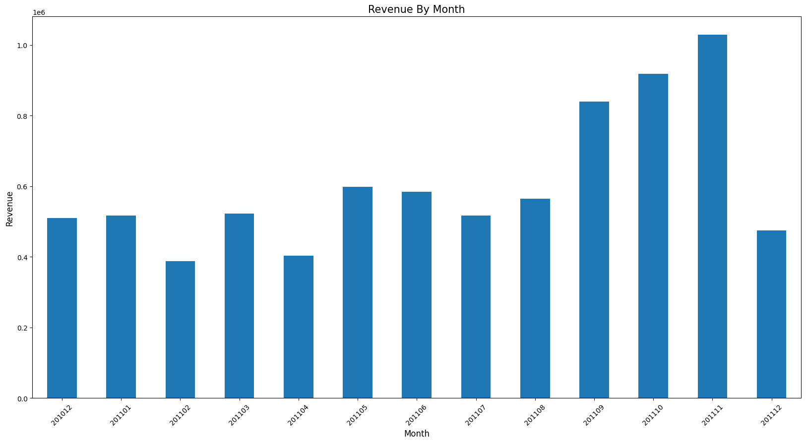
# 위에서 작성한 그래프 코드를 함수화함.
def plot_bar(df, xlabel, ylabel, title, rotation=45, titlesize=15, fontsize=12, figsize=(20, 10)):

# default값이 존재하면 뒤로 보냄.
  plot = df.plot(kind='bar', figsize=figsize) # figsize를 tuple로 받음.
  plot.set_xlabel(xlabel, fontsize=fontsize)
  plot.set_ylabel(ylabel, fontsize=fontsize)
  plot.set_title(title, fontsize=titlesize)
  plot.set_xticklabels(labels=df.index, rotation=rotation)
# 방금 작성한 그래프 함수로 그 위의 월별 매출에 대한 그래프 그리기.
plot_bar(rev_by_month, 'Month', 'Revenue', 'Revenue By Month') # 나머지는 기본값처리
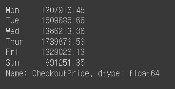
# 요일별 매출 구하기
def extract_dow(date):
  return date.dayofweek

rev_by_dow = retail.set_index('InvoiceDate').groupby(lambda date: date.dayofweek)['CheckoutPrice'].sum()
rev_by_dow
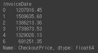
DAY_OF_WEEK = np.array(['Mon', 'Tue', 'Wed', 'Thur', 'Fri', 'Sat', 'Sun'])
rev_by_dow.index = DAY_OF_WEEK[rev_by_dow.index]
rev_by_dow
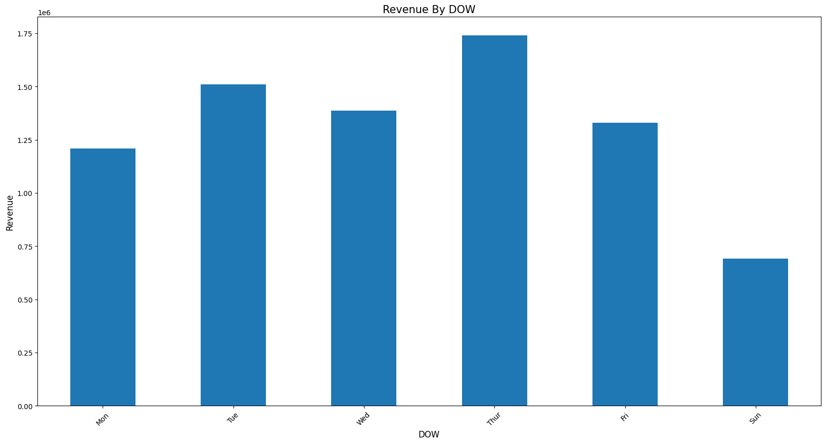
plot_bar(rev_by_dow, 'DOW', 'Revenue', 'Revenue By DOW')
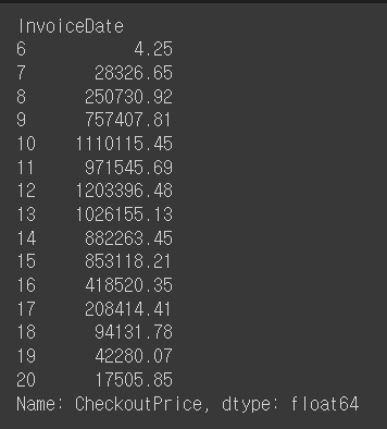
# 시간대별 매출 구하기
rev_by_hour=retail.set_index('InvoiceDate').groupby(lambda date: date.hour)['CheckoutPrice'].sum()
rev_by_hour
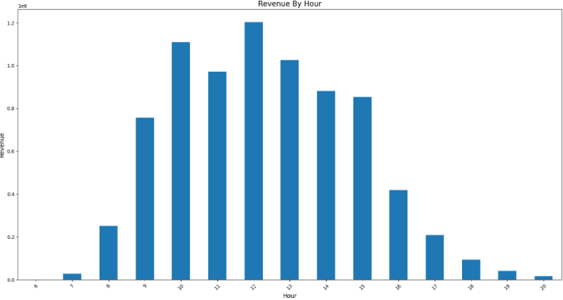
plot_bar(rev_by_hour, 'Hour', 'Revenue', 'Revenue By Hour')
예제
예제1
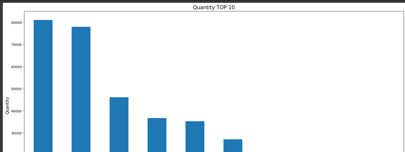
# 판매제품(StockCode)의 TOP10 뽑아보기 (기준: Quantity(수량))
retail.info()
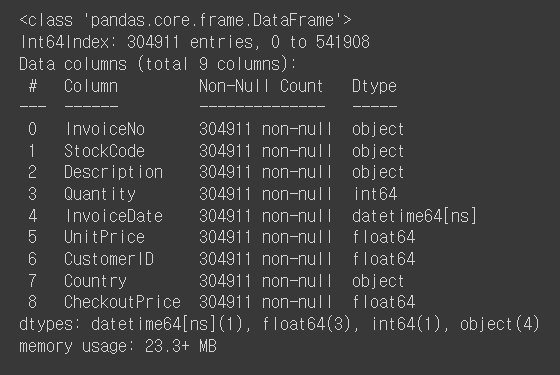
top_selling = retail.groupby('StockCode')['Quantity'].sum().sort_values(ascending=False)[:10]
top_selling
plot_bar(top_selling, 'StockCode', 'Quantity', 'Quantity TOP 10')
예제2
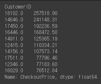
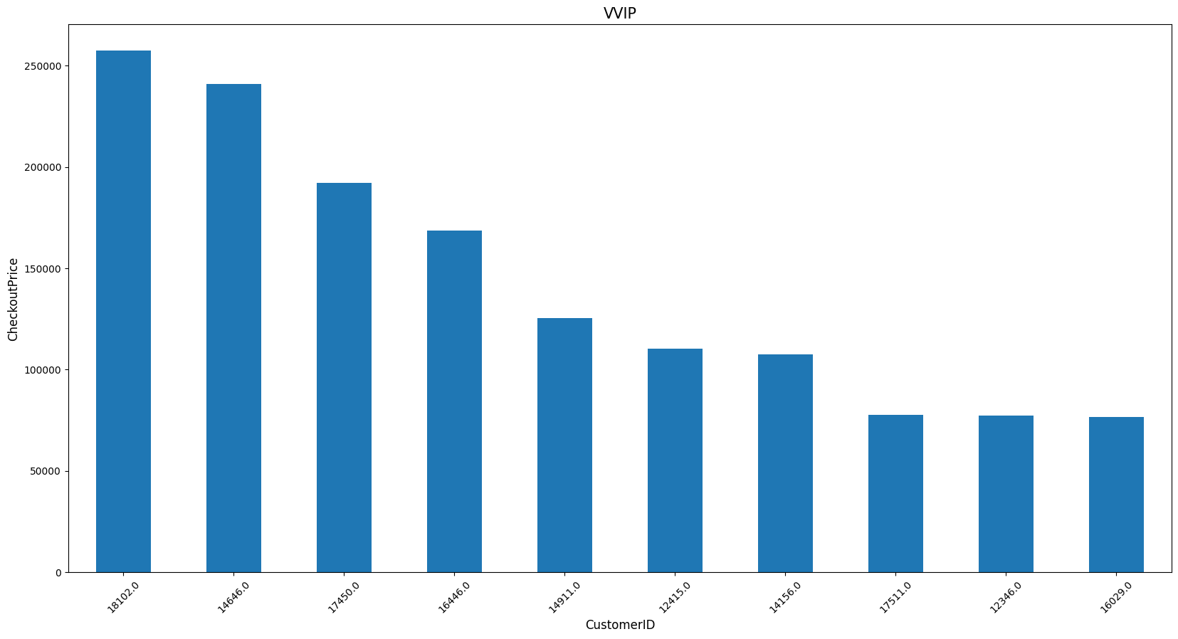
# 우수고객(CustomerID) TOP10 뽑아보기 (기준: CheckoutPrice(지불금액))
vvip = retail.groupby('CustomerID')['CheckoutPrice'].sum().sort_values(ascending=False).head(10)
vvip
plot_bar(vvip, 'CustomerID', 'CheckoutPrice', 'VVIP')
retail.head()
data로부터 얻을 수 있는 insight * 전체 매출의 약 82%가 UK에서 발생 * 11년도에 가장 많은 매출이 발생한 달은 11월 * 매출은 꾸준히 성장 (11년 12월 데이터는 9월가지만 포함) * 토요일은 영업을 하지 않음 * 새벽 6시에 오픈, 오후 9시에 마감 예상 * 일주일 중 목요일까지는 성장세를 보이고 이후 하락 |


